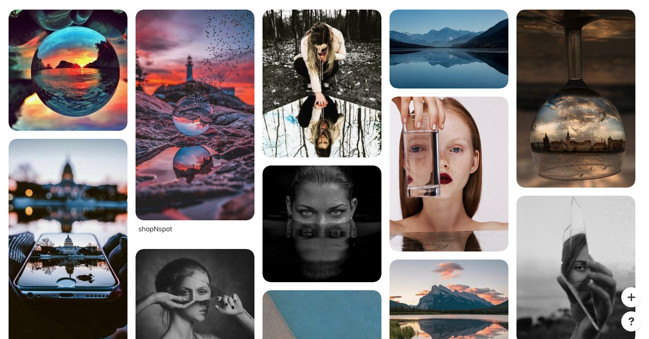
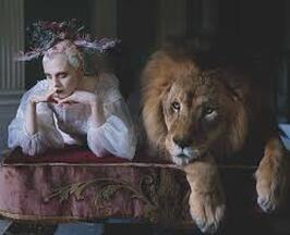
Reflections Pinterest Board
As an introduction to reflection, I made a Pinterest board to explore ideas of reflections and to give inspiration for future photos. A lot of the photos used just a direct reflection instead of having a deeper reflected meaning, so I would've liked to have seen a bigger variety of reflection images on the Pinterest pages. However, the photos that I did come across were still a wide variety and gave me inspiration that I continued thinking about throughout the reflection unit.
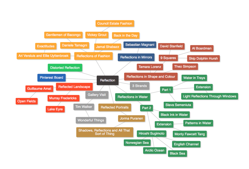
Reflection Mindmap
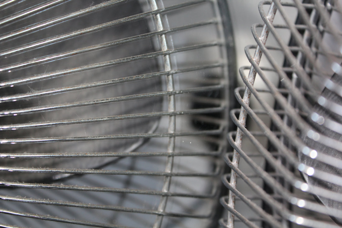
Reflections in mirrors
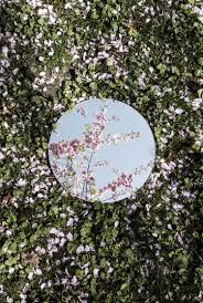
Sebastian Magnani
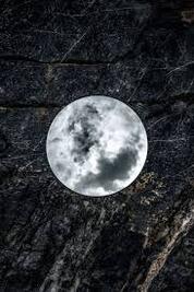
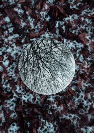
Sebastian Magnani took images of a small mirror on the ground in interesting landscapes where something would reflect onto the mirror, essentially creating two images in one. I love his first image where the dark scene and the black and white mirror reflection makes the mirror look like it is a moon which I think is very interesting as he managed to get a photo of the clouds in a perfect formation where it looks like it could resemble the moon. I also like the last image a lot, as the mirror reflection connects to the background, which makes the photo feel calming and very neat and satisfying. The middle image is amazing as I love the colours in the background, and the tree with no leaves in the mirror is captivating and makes the photo more interesting.
|
|
|
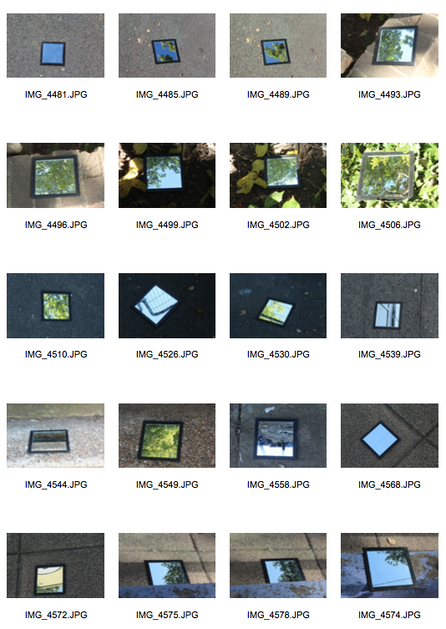
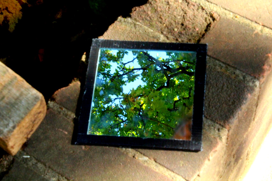
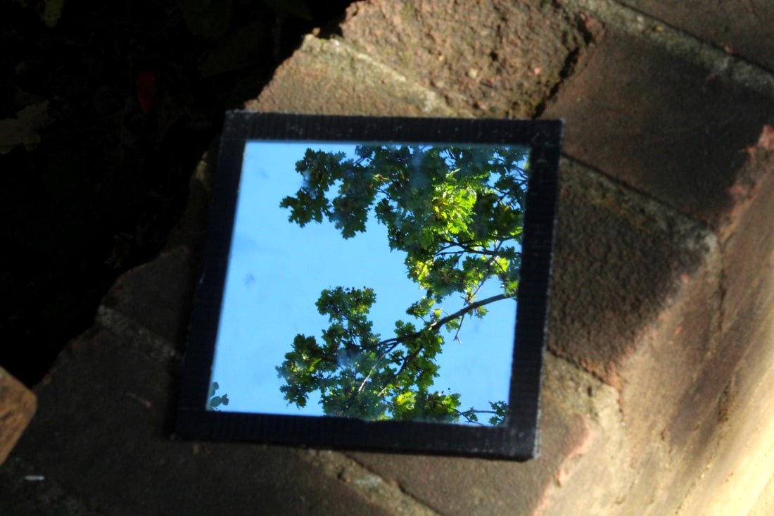
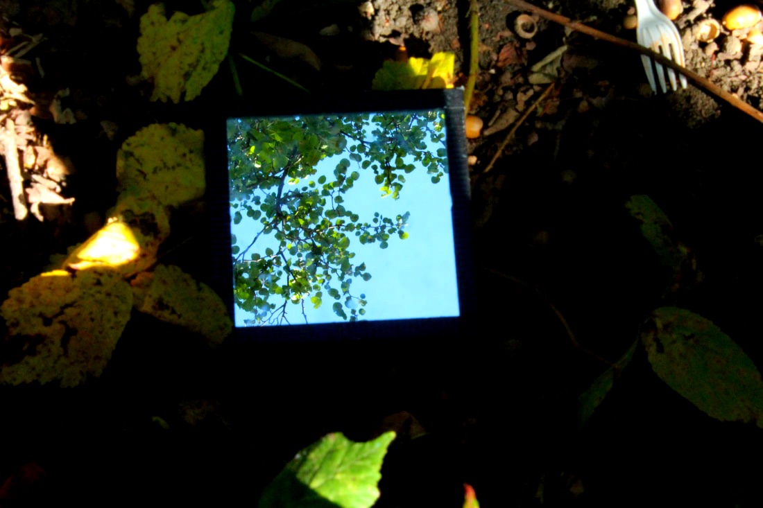
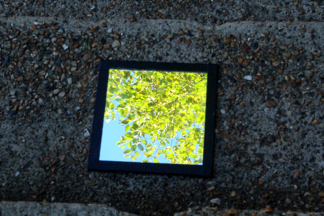
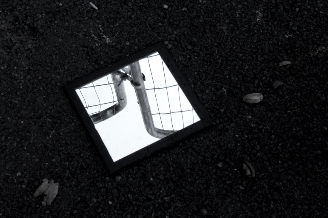
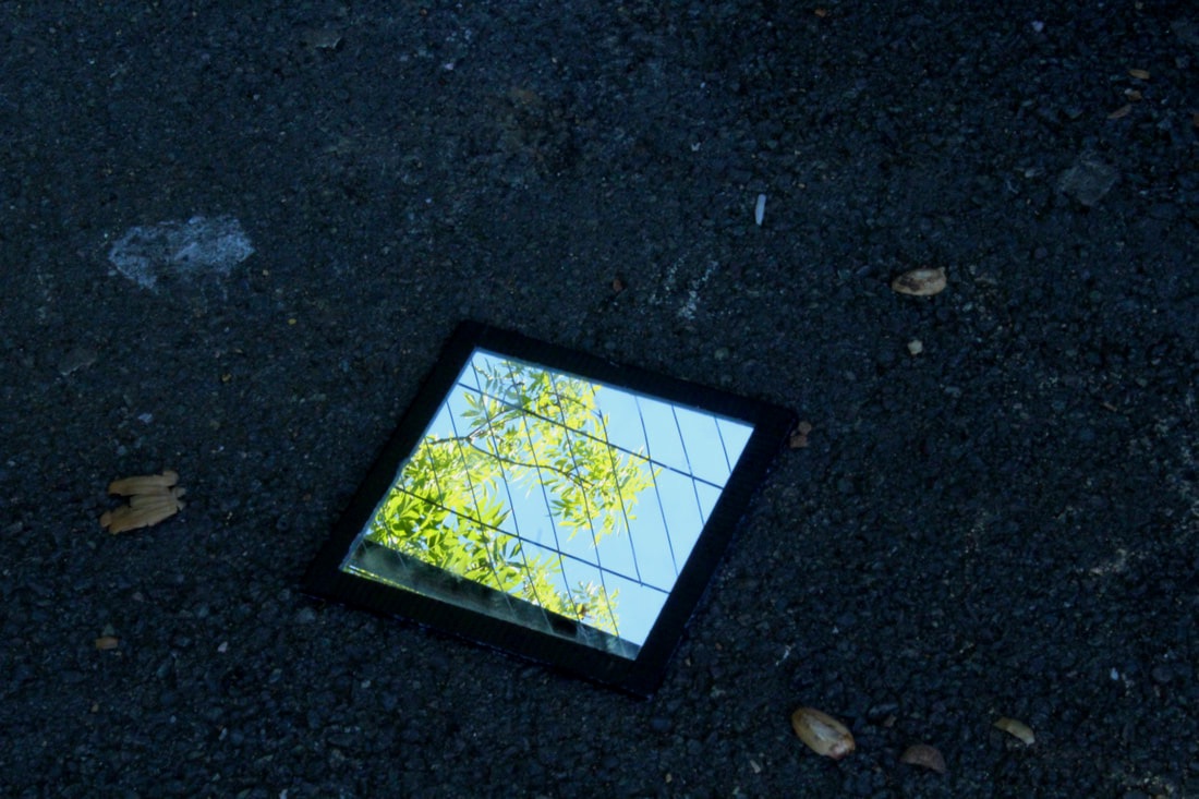
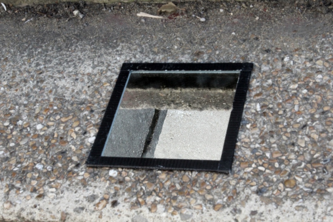
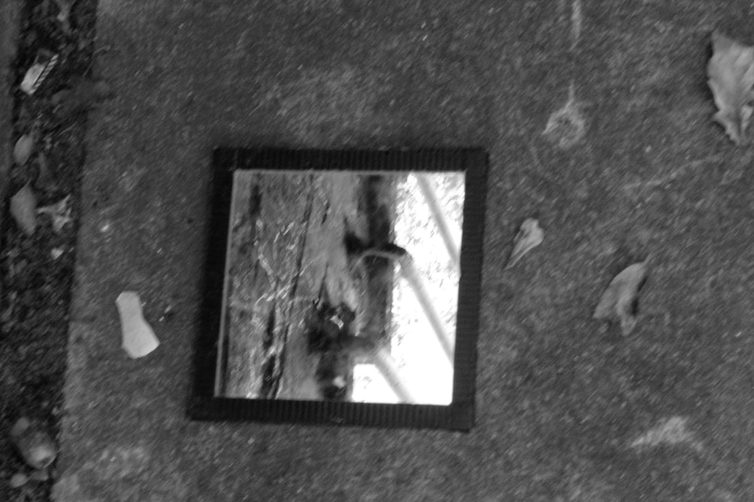
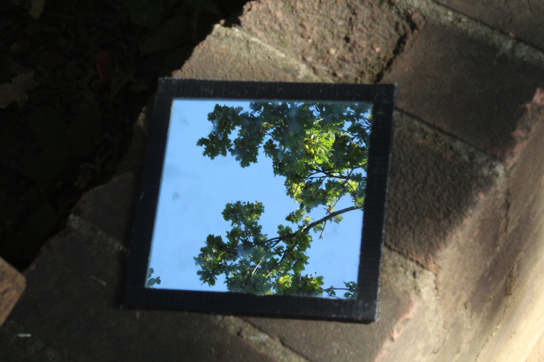
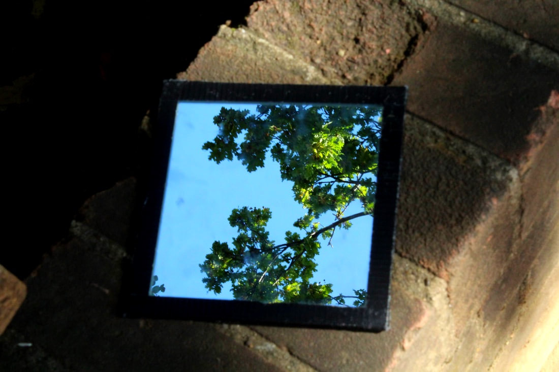
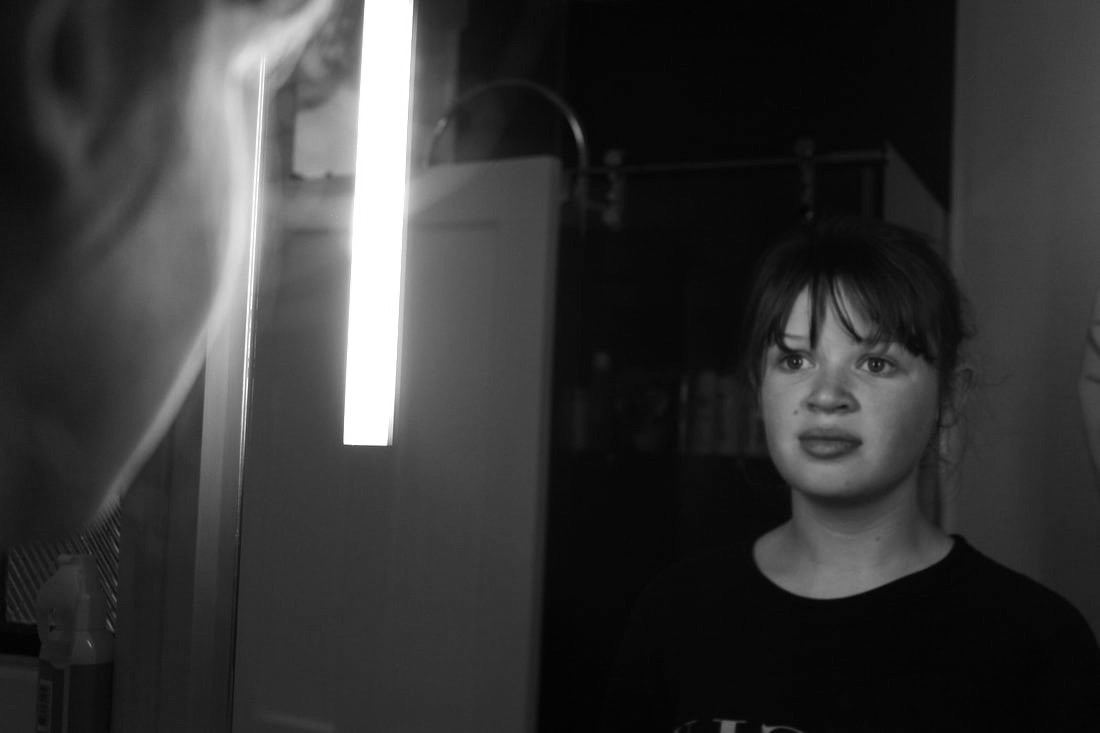
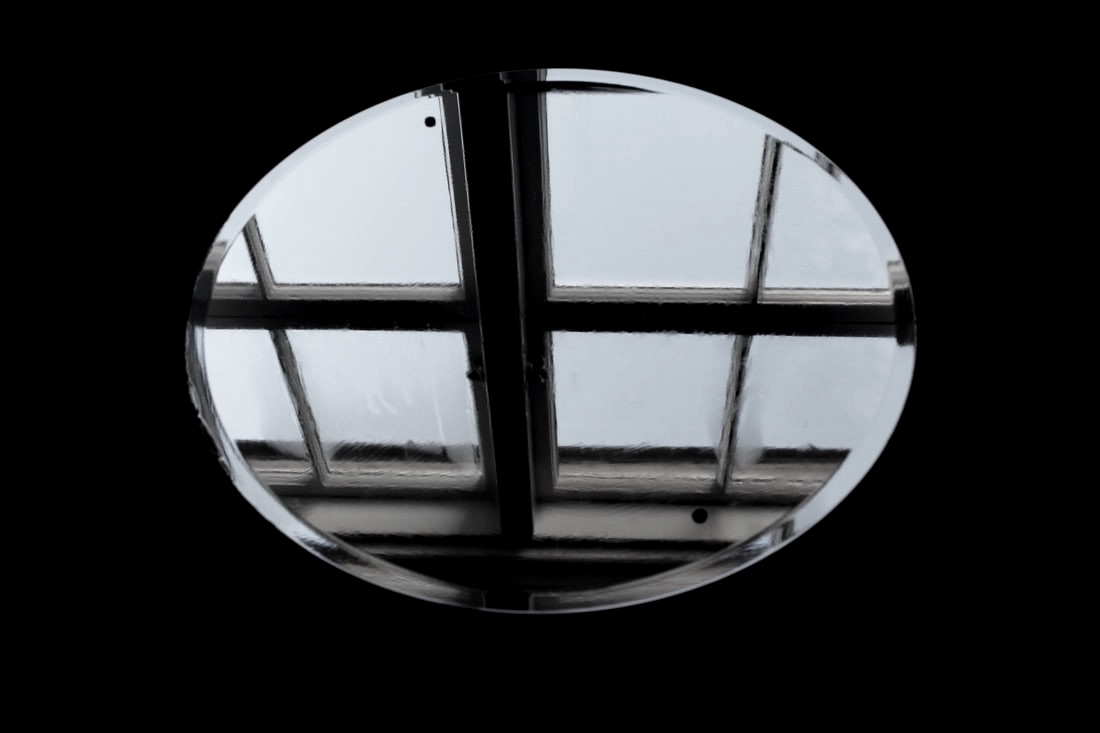
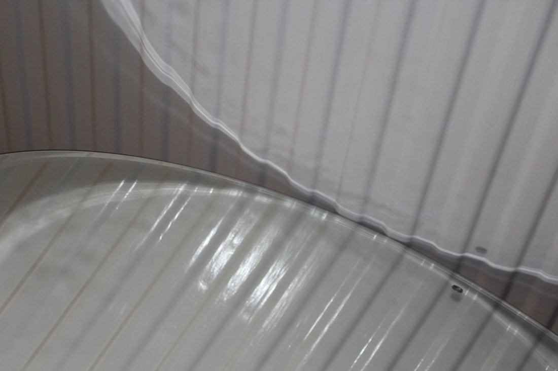
Inspired by Magnani's work, I took a small mirror and went outside to take some similar photos. I really enjoyed this task as usually when taking photos, I don't ever focus on the ground and whatever is above it, however for this project I had to do both. I tried to take images with a variety of things reflecting in the mirror, but in the environment there wasn't very much variation of things in the sky. It was also a very nice day which worked to my advantage in some of the photos, however I would've loved to get some with clouds in the sky. I also found taking these images particularly interesting as to me they look almost as though the mirror is a portal built into the background, leading you to a different universe if you stepped through.
For my photos, I figured that the aperture of F29 worked best to ensure that both the objects in the mirror and the background were in focus.
For my photos, I figured that the aperture of F29 worked best to ensure that both the objects in the mirror and the background were in focus.
|
|
|
|
|
|
|
|
|
WWW: I loved experimenting with these photos and I really like the way they've turned out.
EBI: If I could get a wider variety of things to reflect in the mirrors. I could do this by holding something above the mirror instead of just finding something naturally.
EBI: If I could get a wider variety of things to reflect in the mirrors. I could do this by holding something above the mirror instead of just finding something naturally.
Artist and Me

SEBASTIAN MAGNANI |

MY RESPONSE |
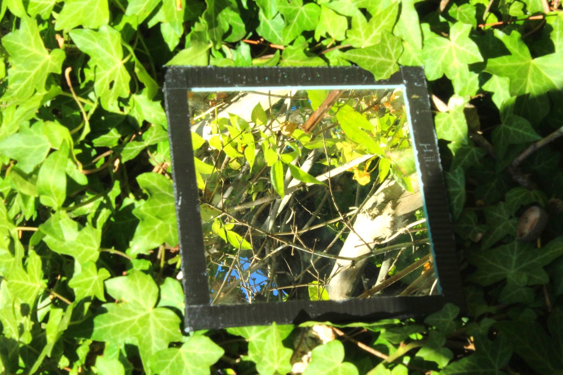
Magnani's images work well as the landscapes in the background had a big contrast to the reflected image in the mirror, which I found really interesting to look at. So, as I was taking photos in response to theirs, I wanted to ensure that there was a contrast in the background and in the reflection, just like Magnani did. I think a lot of my images achieved this, as for example in this one, the dull and dim colours of the background really contrast to the bright and vibrant colours in the mirror reflection. I love this contrast as it almost makes the mirror reflection look like a portal to another world, instead of just another point of view from the same landscape.
Visual Brainstorm

Magnani's photos
|

|
My response
|
The edit
|

|
Reflection in shape and colour
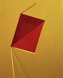
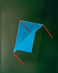
Tamara Lorenz
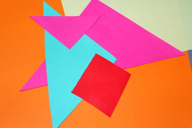
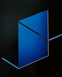
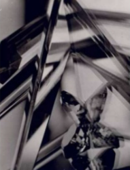
Lorenz's photos are interesting because I think they look very modern and the geometric shapes make it look really nice. The colours are bright and neon which makes the photos more captivating. I particularly love how the photos are super simple and yet all the different shapes and colours are placed together to create an image that's still simple but also interesting to look at. It makes you want to find out what the photo is actually of, and although it's not a real object, it still looks like it may be something with more layers to it as you can really see the 3D effect in it. I also like the thin red lines in the last photo as they contrast to the big blue triangles around it which is very effective.
|

|
|
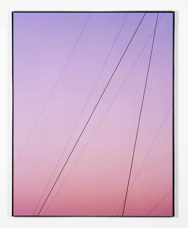
Theo Simpson
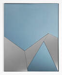
Simpson took photos similar to Lorenz's style. I think that again, the geometric shapes work really effectively for these photos as it shows a certain level of simplicity these images, which makes them super captivating as although theres not a lot to focus on, the patterns and shapes attract attention and especially in the last photo here with the bright red, it creates an interest around the odd shape which looks slightly 3D. I also love the first image as the pastel colours make the photo really calming, and I love the mixture of the simplicity of the lines mixed with the smooth gradient of the colours merging together, which creates an overall relaxing effect. In the middle image, I love how the pale blue contrasts to the metallic grey. The triangles and trapeziums add to the contrast as the range of different shapes show a certain conflict within the otherwise calming colours. The main difference between Simpson and Lorenz's photos is that Lorenz took images that looked less realistic, and instead look edited and geometric, however Simpson's look as though they could be a structure or area that is actually real, for example, the first photo looks like wires either going down the side of a wall or across the sky, like we see often around roads and motorways.
|

|
|
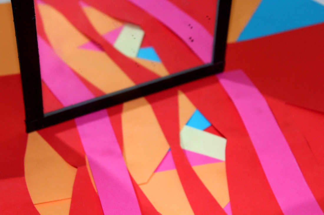
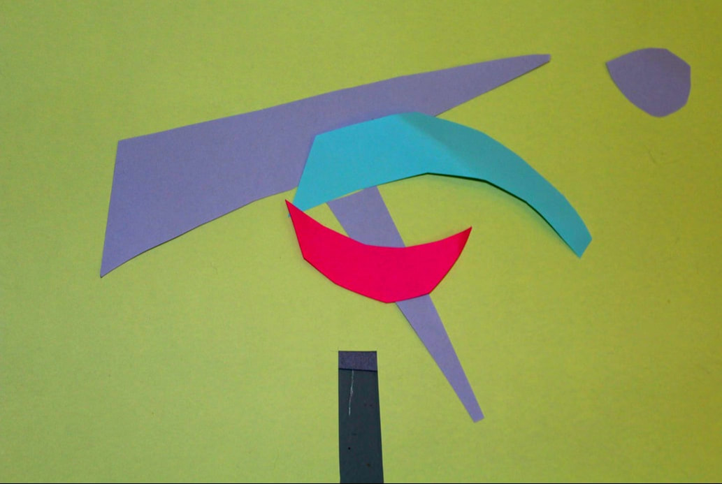
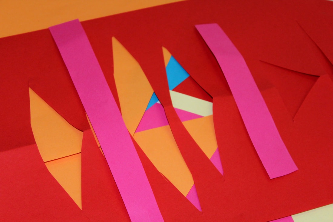
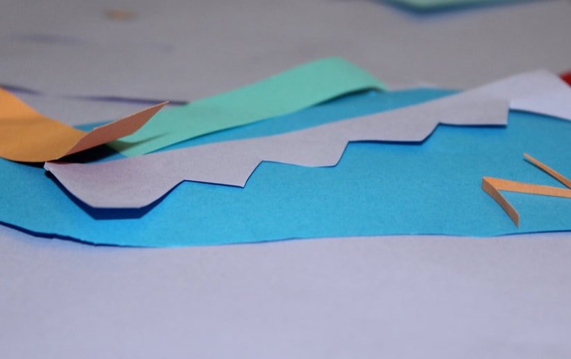
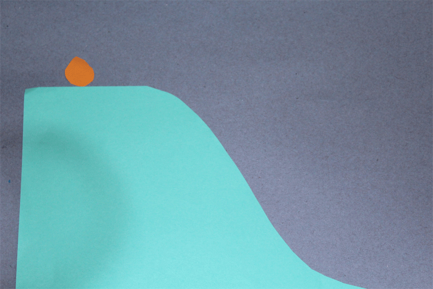
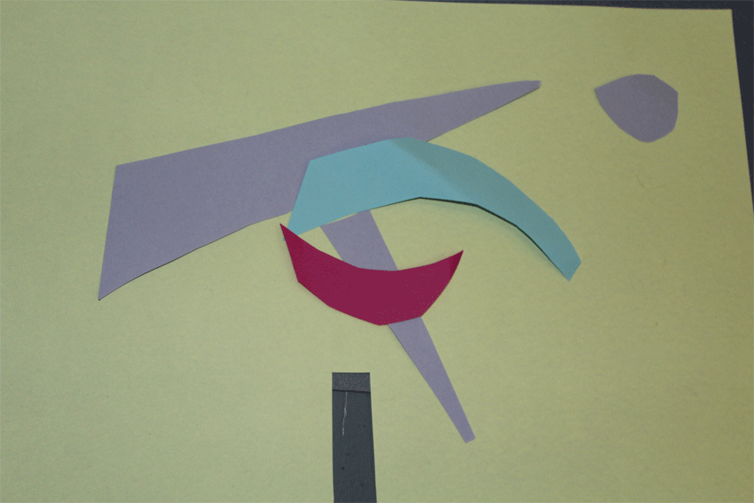
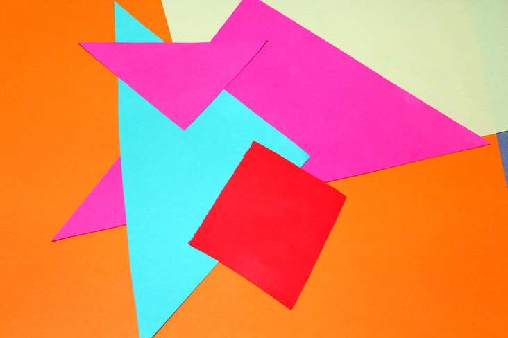
Inspired by the work of Lorenz and Simpson, I took different coloured pieces of paper and cut them up and placed them in different arrangements. I found the colours showed up a lot better when using flash, and I really like how a lot of them turned out. We also tried making GIFs of the paper moving about the shot, and I enjoyed thinking of ideas to make the GIFs of, however it was difficult trying to keep the different photos still without using a tripod, so when making the GIFs they were quite messy. I would like to do more responses of these, and maybe even try to edit them more on photoshop, making them look cleaner and more abstract, instead of just like cut up paper, which is what it actually is. I want to do this because I prefer the look of photos where you can't always work out what the object in the photo is in real life, as it looks like something that's been altered or taken in a specific way in which it looks unrealistic, to an extent.
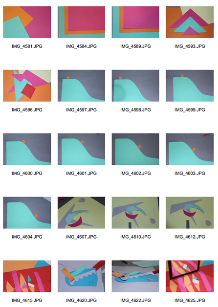
The photos I found most effective were the ones with the brighter colours and more geometric shapes, such as squares and triangles. I used a mirror for a few of the photos, which I thought did definitely make the photos seem like they had another layer to them. Next time, I would use a mirror for more of the photos, and I would try to get both the real paper and the reflection to be in focus, because in my favourite photo using the mirror, the reflection was slightly blurred, which didn't work very well for the kind of photo I wanted to have taken.
|
|

|
|
|
|
|
|
WWW: I love the photos as the bright colours really make the shapes and patterns pop.
EBI: If the GIFs were less shaky. I could improve this by using a tripod to do future GIFs.
EBI: If the GIFs were less shaky. I could improve this by using a tripod to do future GIFs.
Artist and Me

TAMARA LORENZ |

MY RESPONSE |
THEO SIMPSON |
I think I responded well to the link artists as I effectively used geometric shapes and bold colours to mimic their work. To further extend, I would love to use thin lines like Lorenz used, as I think it adds a more delicate side to the image and it looks more polished and intricate. I definitely prefer the brighter colours in these photos as although I do like the cool tones of blue, I think that the more vibrant colours make the shapes pop and attract more attention to the image.
Visual Brainstorm
Lorenz and Simpson's photos
|
|
My response
|


The GIF
|
The edit
|
|
Distorted Reflection
Antonio Gutierrez
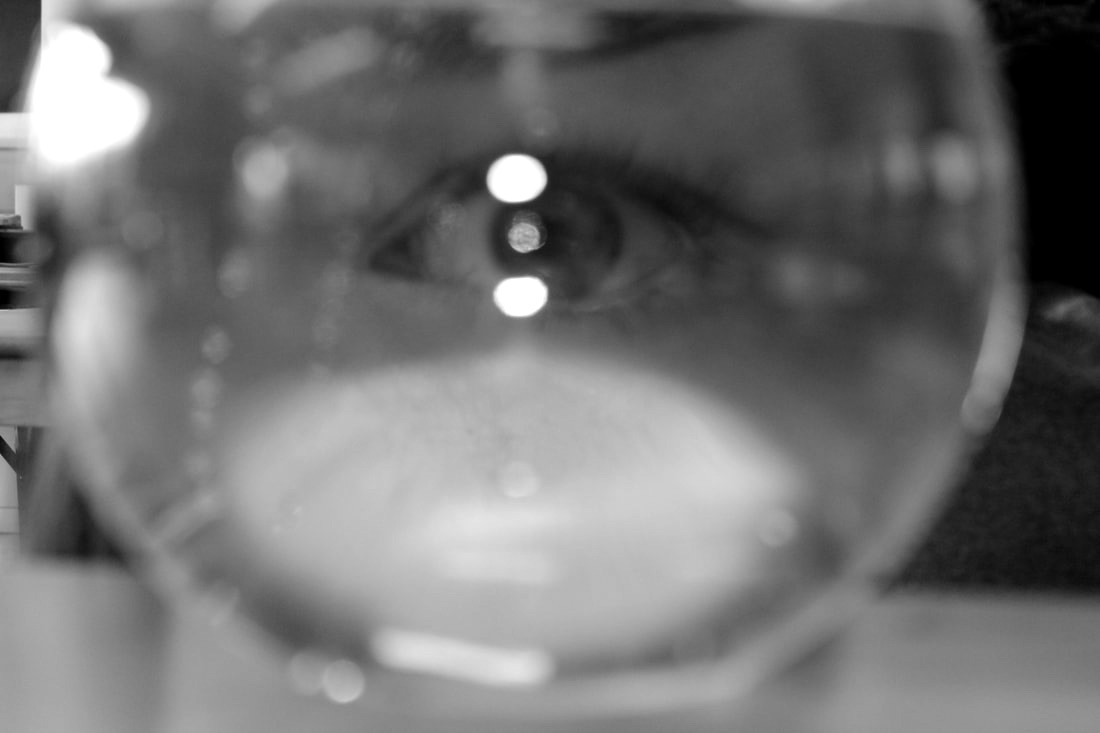
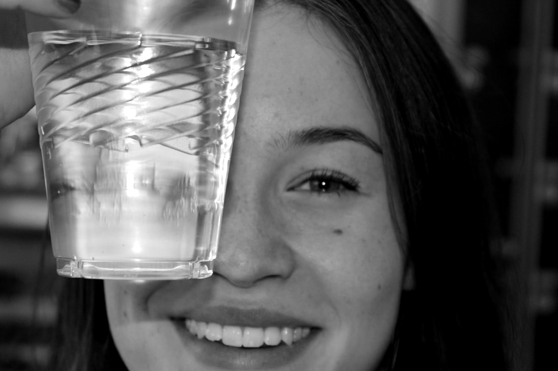
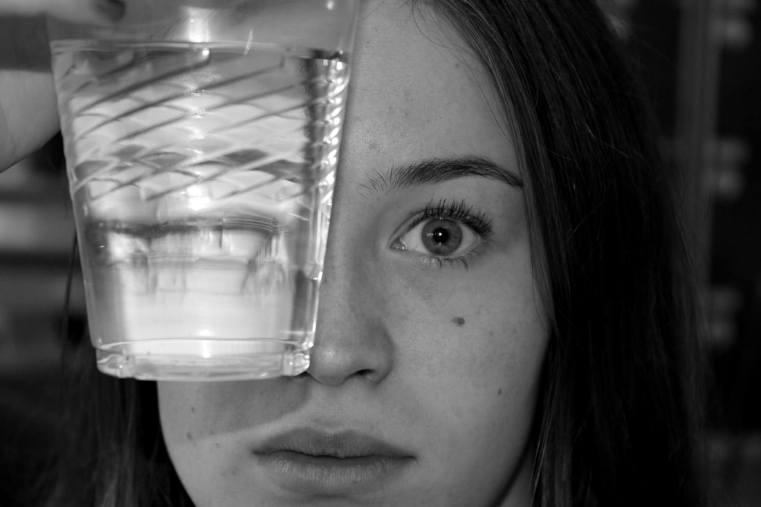
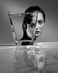
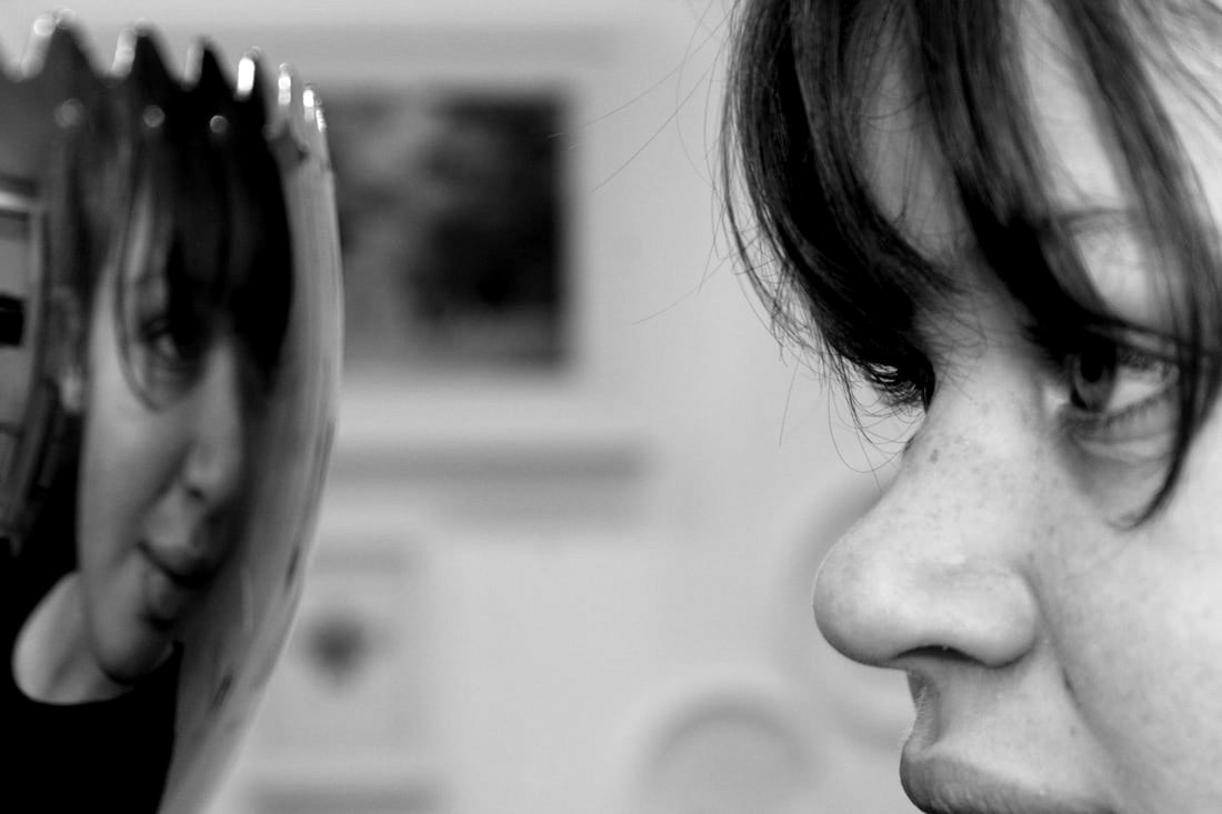
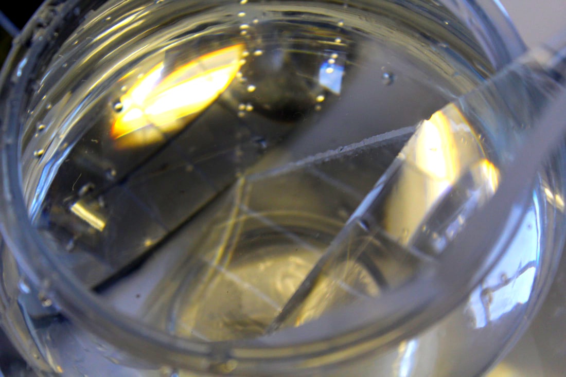
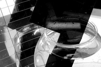
Gutierrez took photos where he'd get different containers filled with water, and would take photos of a person behind the water. This would give the effect that the person's face was distorted. I find these photos really interesting as it creates an image that looks edited when it's not. I like that the images are in black and white as it removes any focus of anything else in the background of the photo, and just draws all attention to just the distortion. I particularly like the image in the middle as it's amazing how the model's whole face is split in half like that. Seeing these photos again after taking some of my own makes me realise how good these ones are as it's really difficult to get the water to distort the face in the way you want it to.
|

|
|
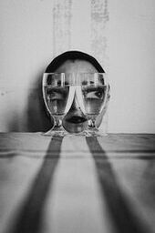
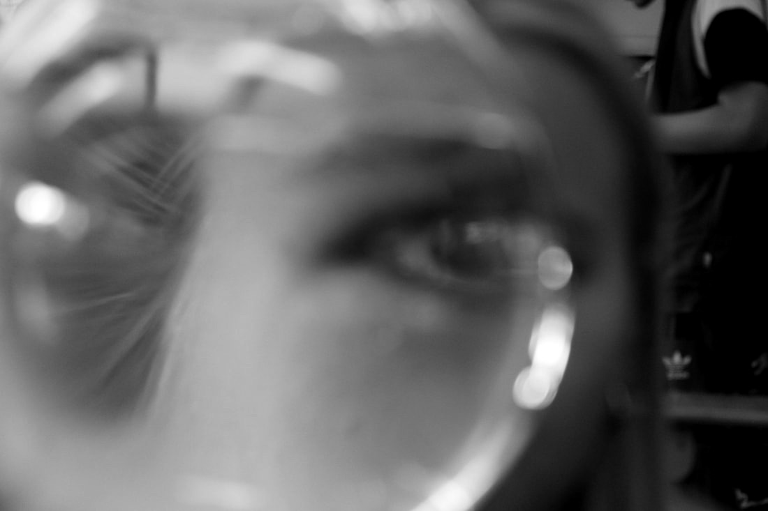
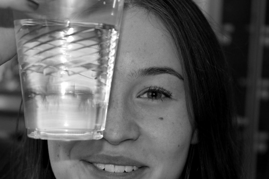
Taking inspiration from Gutierrez' photos, I took some distorted reflection images of my own. We filled up different containers with water and took photos where the model's face became distorted through the reflection of the water. I then turned them into black and white to show further inspiration from Gutierrez, and I really like the way some of them turned out. As this was only a first response, I found it quite difficult at the start to figure out things like how much water was best to use, how close to place it to the model, and what angles were the best to take the photos from. As it took a while to figure out what made for the best photos in my opinion, I didn't get as many photos from my first response as I would've liked to. However, I do like the photos that I did take.
|
|
|
|
|
|
WWW: I really like my final edits and I think the photos represent the task and Gutierrez' work.
EBI: I wish I had gotten more photos with more imaginative distortions.
EBI: I wish I had gotten more photos with more imaginative distortions.
Second Response
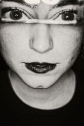
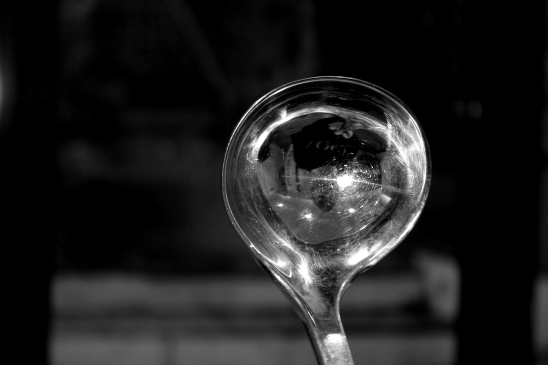
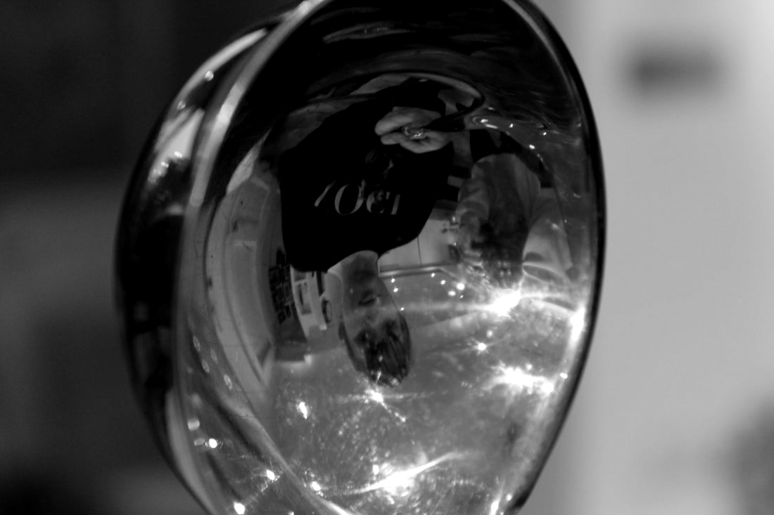
For my second response, I took more photos at home where I'd capture distorted reflection in things like spoons, glass and mirrors. I love the photos I took as I think although it's the same task as my first response, I think my second response has a variety of different distortions. I also put these images into black and white, as I loved the effect they had on the photos in my first response, so I decided to repeat it in my second response. There was one image which I liked equally as much in colour as I did in black and white so I put them beside each other to show the two different sides of the images. Although they're not directly 'distorted' reflection, I still think that they show a somewhat distorted image as the reflection is looking straight back on the model, and that shows a reflection of the distorted inside of a person - like their emotions and feelings.
|
|

|
|
|
|
|
|
|
WWW: I think these photos are definitely better than my first response and I love the different angles and viewpoints I used for them.
EBI: I could take more with distorted reflections using water, as I'd love to develop my collection of photos with that technique.
EBI: I could take more with distorted reflections using water, as I'd love to develop my collection of photos with that technique.
Artist and Me

ANTONIO GUTIERREZ |

MY RESPONSE |
I liked my photos in comparison to Gutierrez's as although the one I've selected here isn't using water, I still see it as a distorted reflection inspired by their work. This is shown through things such as editing the image into black and white. I love this photo, as it looks ghost-like and eerie, which gives a different feel and aura around the distortion. I would definitely like to take more photos using water to distort a face, as Gutierrez did it really well and I would love to try to perfect the skill and find out how to do it most effectively.
Visual Brainstorm
Gutierrez' photo
|
|
My response
|
Second response, edited
|

The edit
|
|
Refraction
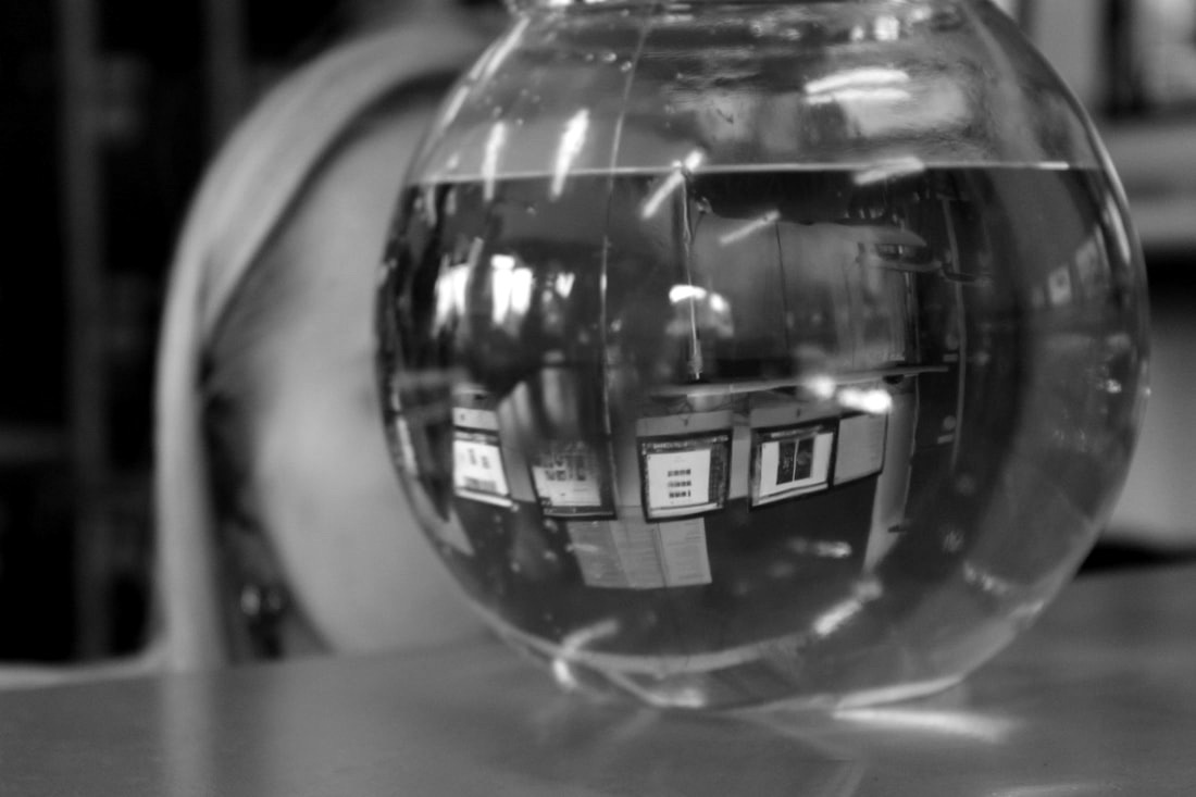
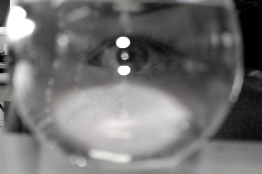
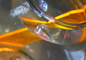
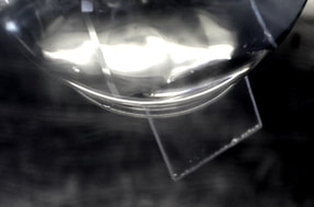
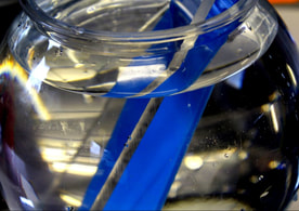
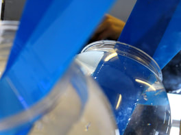
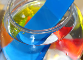
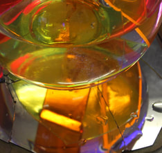
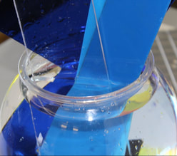
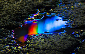
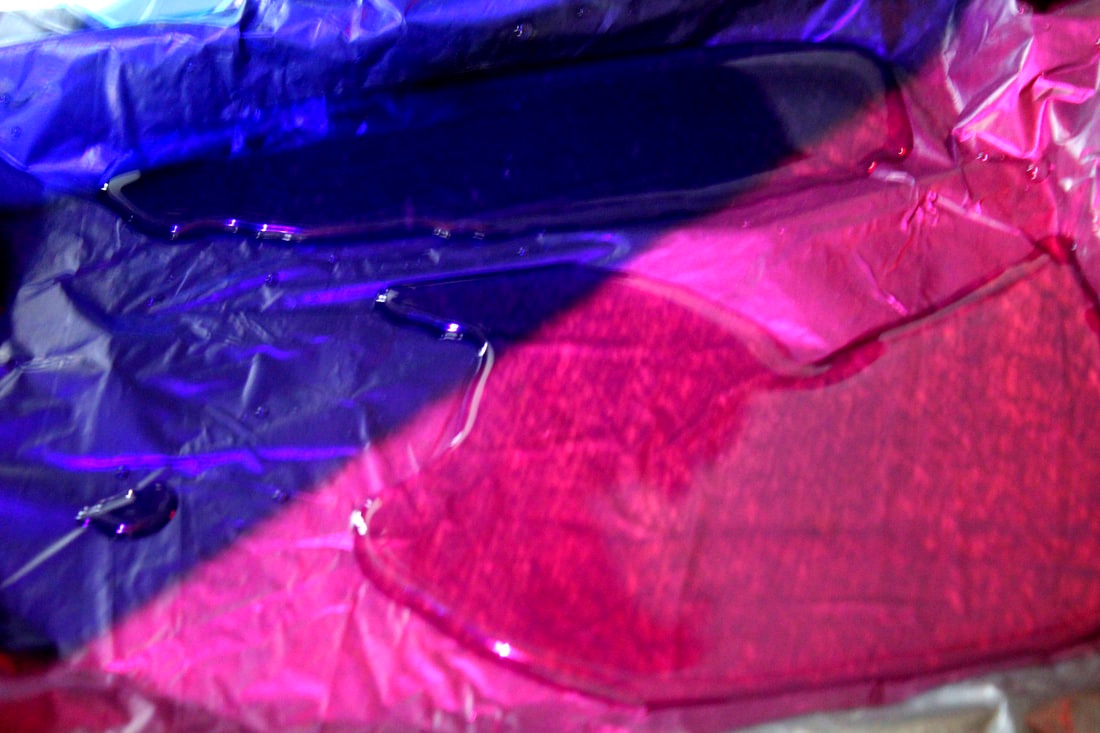
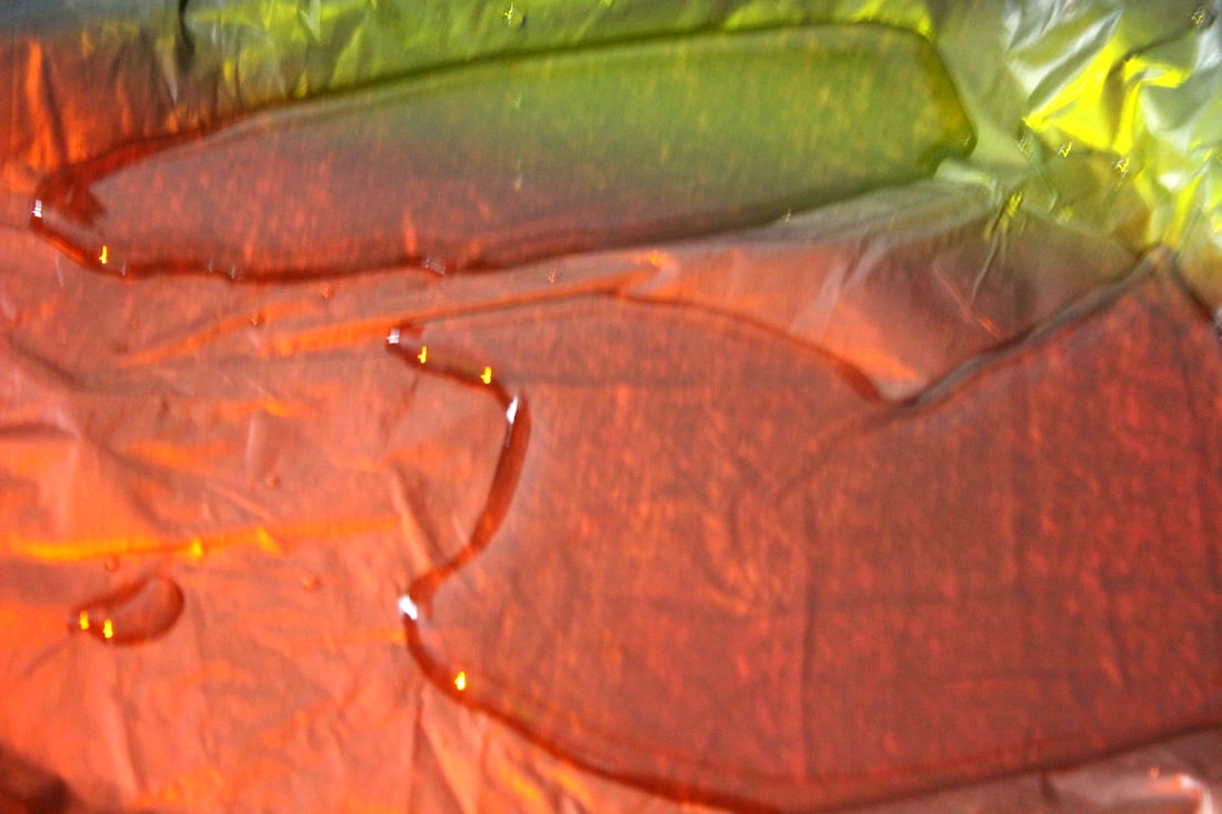
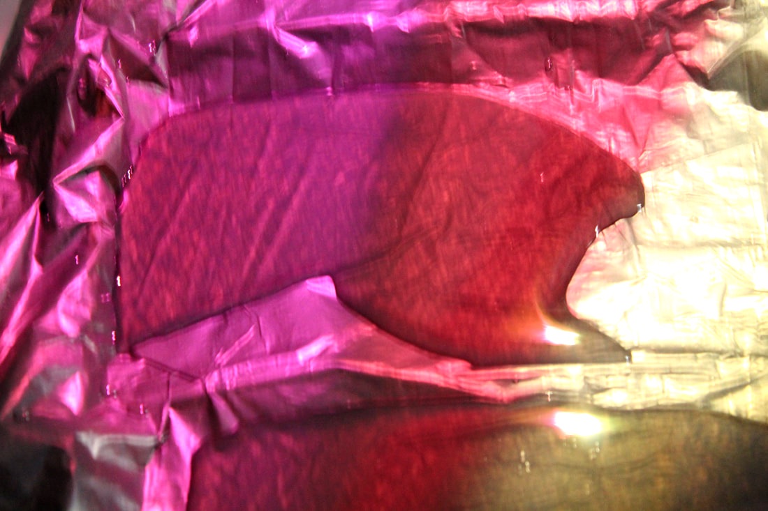
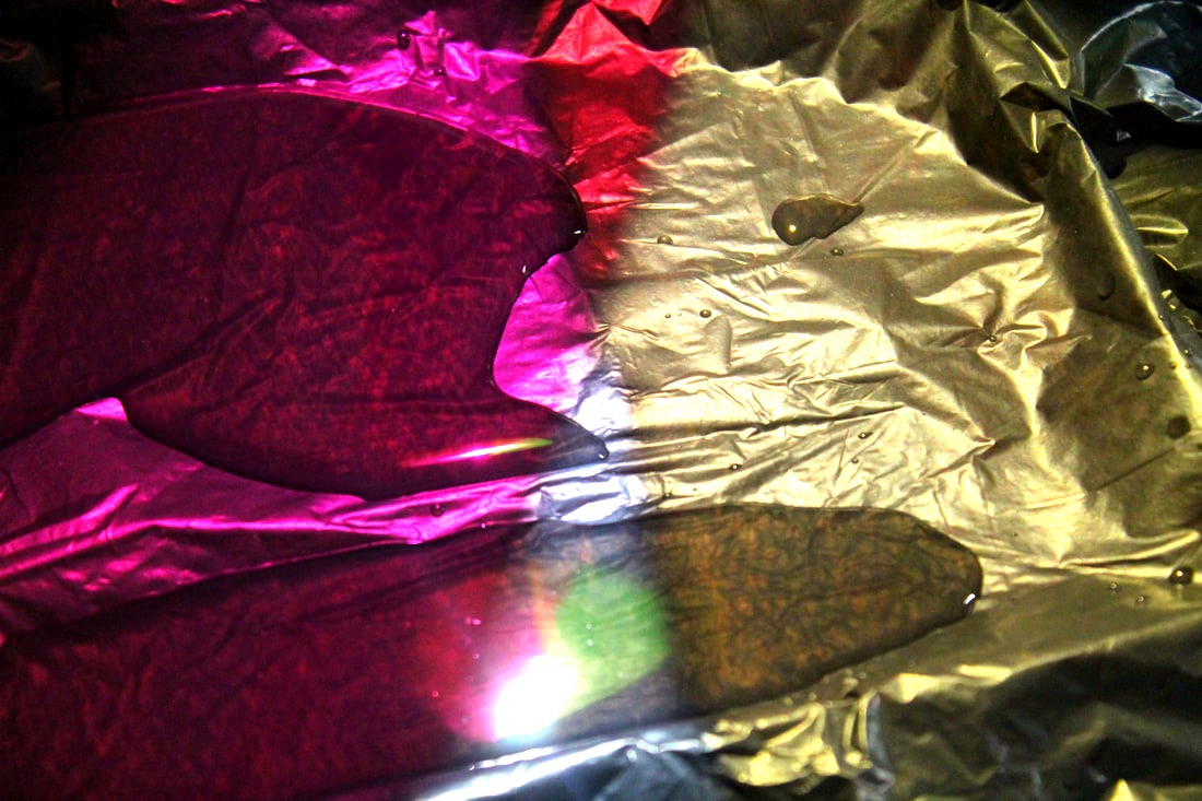
To extend on my distorted reflection photos, I took photos of things refracting in water, showing a bigger variety of things appearing distorted due to water. We shined a torch on some pieces of coloured or clear plastic to put more of the focus of the image onto the plastic and how it's refracted instead of anything else in the image, meaning people's eyes are drawn towards to focus of the image meaning straight away, they see and focus on the refractions. I also used mirrors to show a reflection of the refraction and the whole bowl of water. My favourite photos that I took were the ones where I used both the torch and mirrors to get a range of different lights, reflections, and refractions in my image.
|
|
|
|
|
|
|
|
|
WWW: I love the final edits and how many of them show several layers of reflection and refraction.
EBI: I would like to get a larger variety of photos, for example using different containers of water and different objects to refract.
EBI: I would like to get a larger variety of photos, for example using different containers of water and different objects to refract.
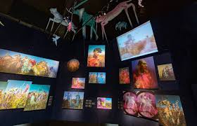
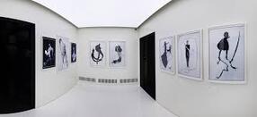
Tim Walker - Wonderful Things
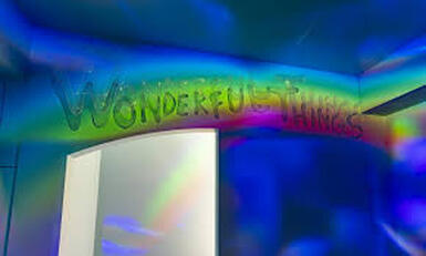
We visited the Tim Walker 'Wonderful Things' exhibition in London. While we were there, we looked around the different sections of the museum and looked at some work of other photographers and artists. When we went into Tim Walker's exhibition, we looked around all of his different photography and the different projects he'd done, and we closely examined and annotated his work, while taking photos of some of our favourite pieces.
|
|
|
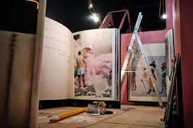
Everything about the exhibition focused on all the details, for example, not only the photos were part of the display, but also each room was carefully designed to present the photos and work to their full potential, and everything linked up and felt organised and coherent. As you walk through the exhibition, it almost tells a story, as each section had it's own meaning and individuality, which really captured my attention.
|
|
|
I thought his photos were incredible and inspiring, as he really focused on details in every single shoot he did, meaning every individual element in the photo joined together to create something with a message and a beauty behind it. He took a lot of very unusual photos which many people are not used to seeing or maybe are a bit taboo to discuss, meaning those photos made people think about what they were looking at and saw how he presented these things as acceptable and normal, which a lot of them should be, in my opinion. This meant that his photos not only had a message, but also had an impact on the people viewing them, as they take away from it a mindset in which they may think about certain aspects of society in a different way.
|
|
|
I was inspired by a lot of his work, as I think he created beautiful, slightly abstract in a way, and interesting images, and they showed how focusing on tiny details while taking and editing photos really makes a difference to the final outcome of the photo, as one tiny detail could change the message of the photo; change how it is perceived; or change it's overall quality. I think every single shoot he took showed the work and effort behind taking that one final photo, and it made me think about how different the photo may be without all of the hard work he put into it. Therefore, I now try to focus on more details while taking and editing photos, as this exhibition showed me how much of a difference that can make to a photo, as it can push it to looking more professional and well-made overall, without ruining the original concept of the photo.
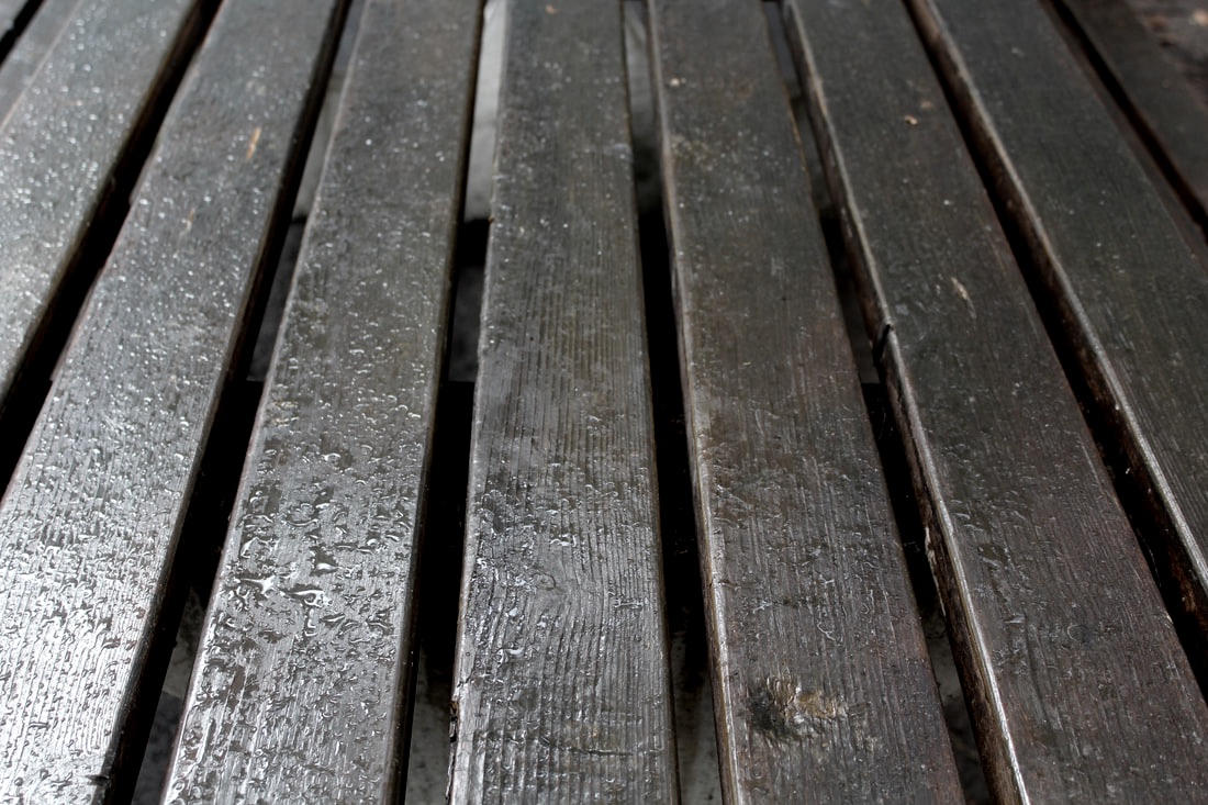
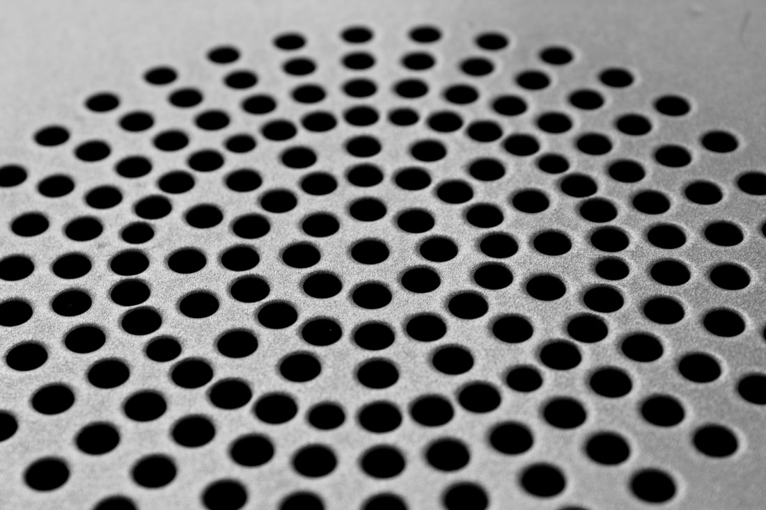
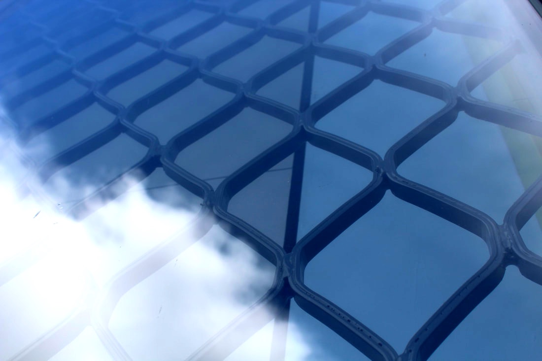
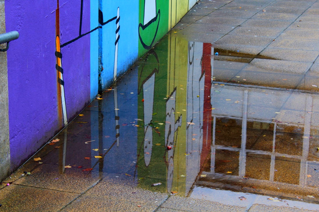
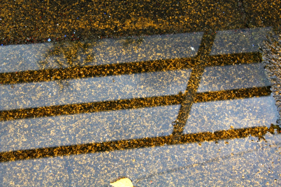
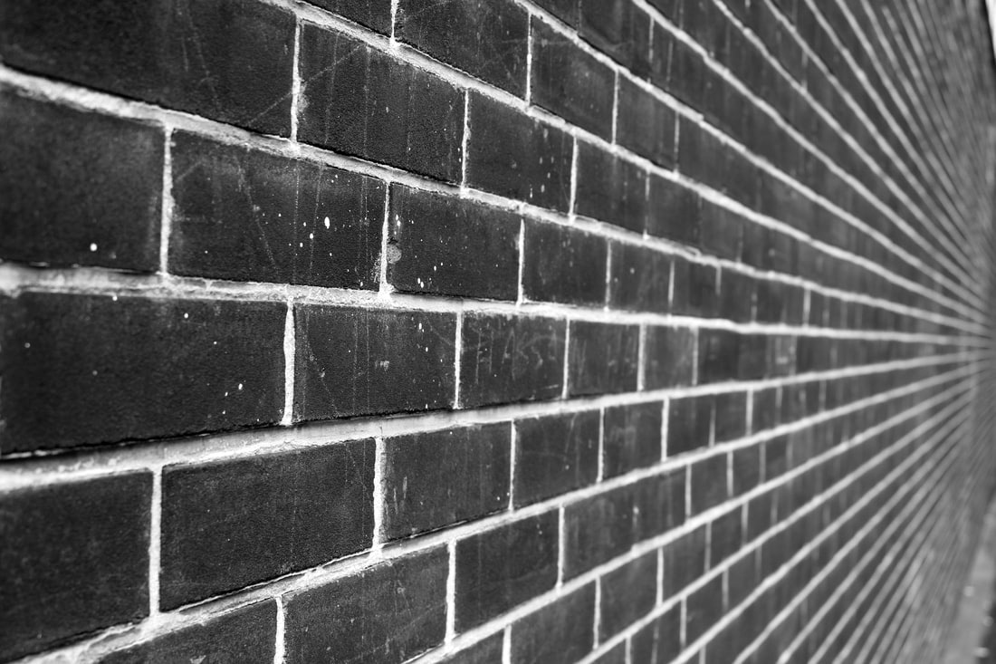
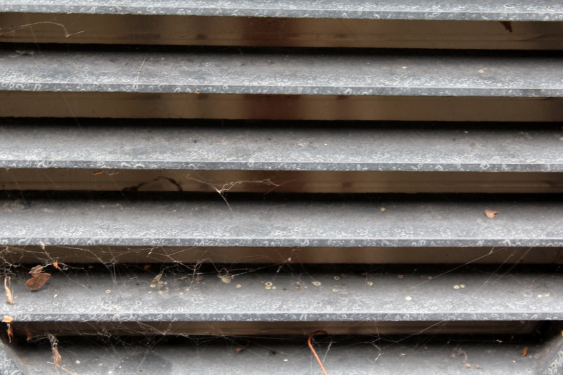
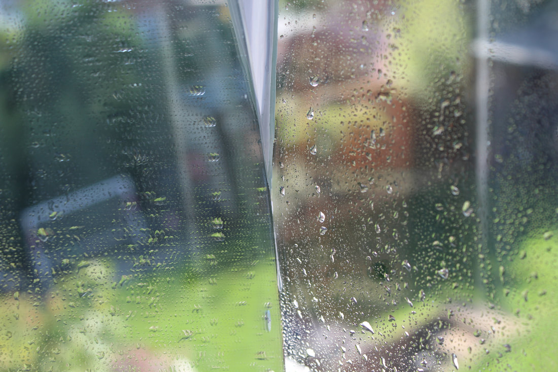
Patterns and Structure and Reflections
Using previous knowledge of reflections of shape, I applied that to get reflections of patterns and different structures. I experimented with different angles and perspectives, and tried to pick out things such as reflections in puddles, as luckily it had rained not too long ago. The most effective images were the ones where there was a good reflective surface that reflected a pattern in something like a building, as they really put the main emphasis on reflection and pattern. I also like the photos where there is a clear, symmetrical, and neat pattern, as they are pleasing to look at as they're organised and laid out well enough to make an effective photo, meaning it was easier to take a photo that looks symmetrical.
For my final edits, I picked out the photos which were the most pleasing to look at, and showed the best and most creative forms of reflection in structures and patterns. I also changed a lot of the colours and tones, as for many of the photos they turned out best when they were either less saturated or more contrasted. For most of the literal reflections in the photos, they showed up better where there was more saturation and colour and more contrast, as it really showed the finer details and made the reflection more present and crisp than with a lesser contrast or saturation.
|
|
|
|
|
|
|
|
|
WWW: I like the different patterns and reflections of patterns I took.
EBI: If I went to different locations to take a wider variety of images.
EBI: If I went to different locations to take a wider variety of images.
Homework
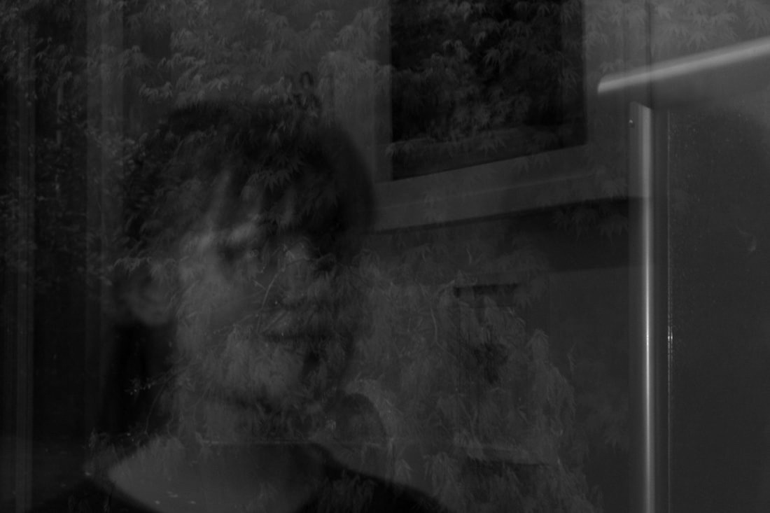
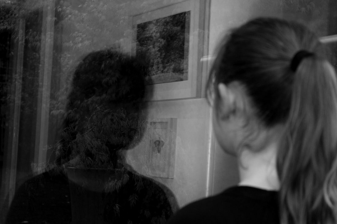
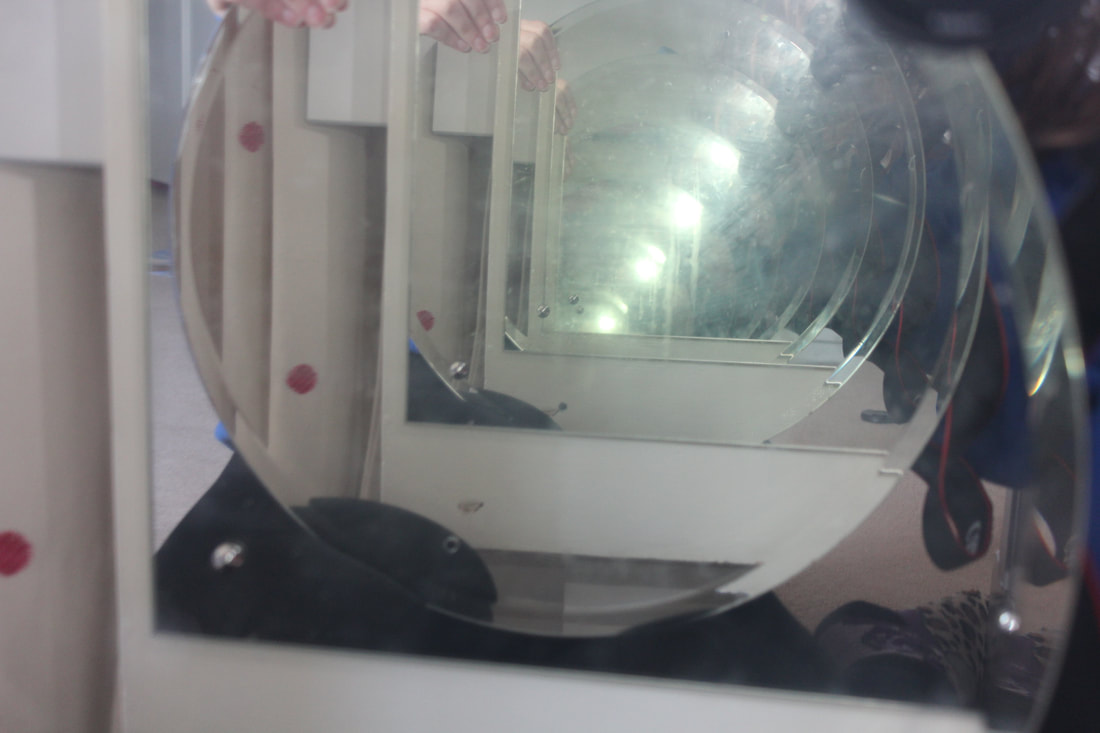
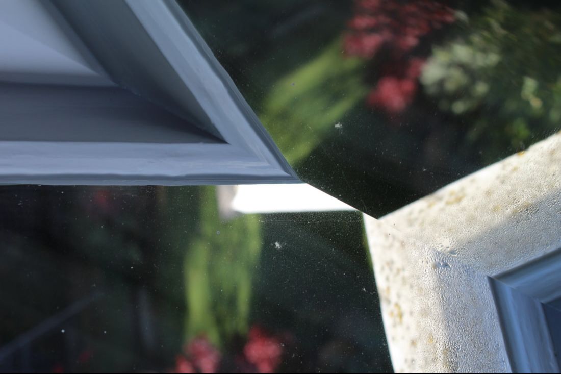
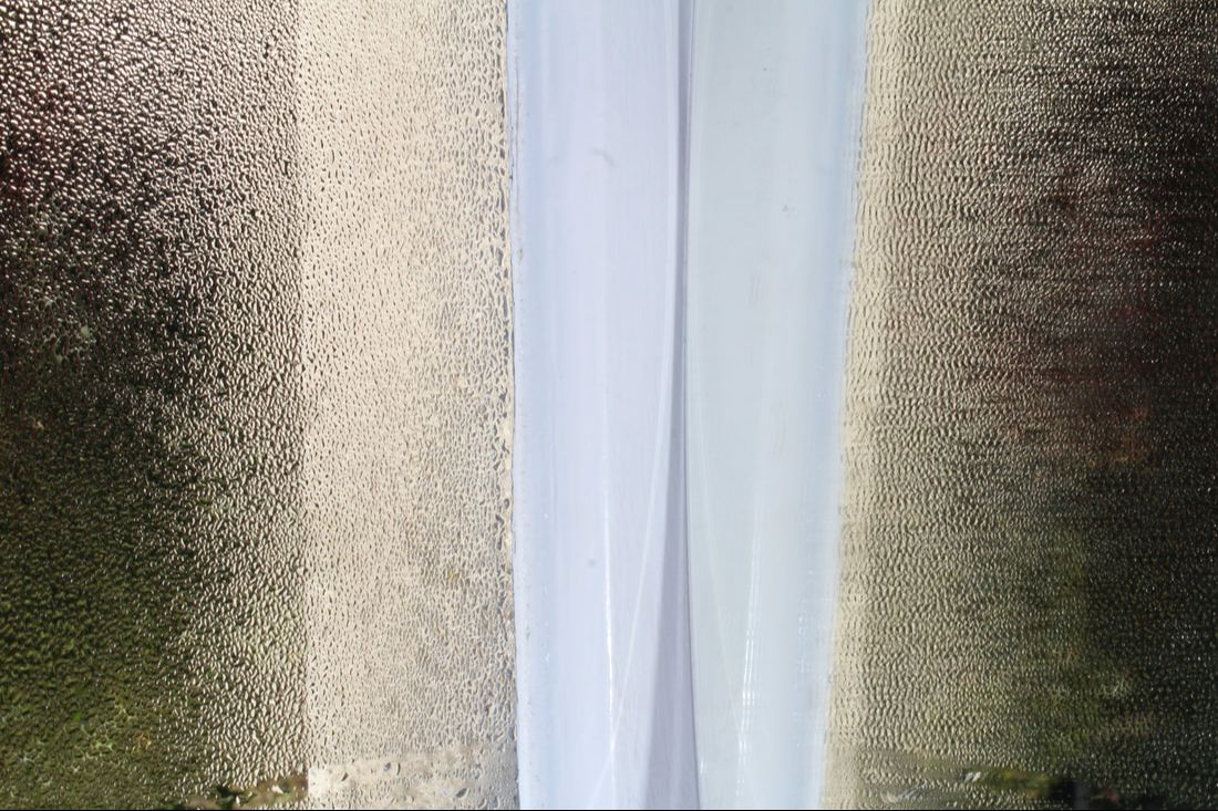
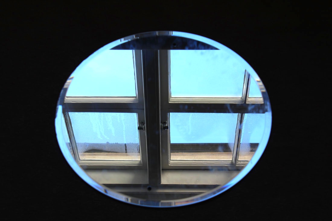
For my homework, I decided to take photos with several different reflections, for example distorted reflections, reflections of reflections, reflections of patterns, reflections of buildings etc. I love how they turned out, especially the ones where you have to look at them for longer to work out what the photo is actually of. I used a mirror and held it up to different objects and surfaces, meaning the photos are more interesting and have more layers to them. I tried to draw on what I found worked best from previous reflection work, for example using Magnani's photos with a mirror reflecting an image on top of a different surface, and using my knowledge of reflections of pattern and distorted reflection.
|
|
|
|
|
|
|
|
|
|
|
|
|
|
|
WWW: I think I have a good variety of different types of reflections.
EBI: If I took some reflections of things like giant skyscrapers, for example in Central London.
EBI: If I took some reflections of things like giant skyscrapers, for example in Central London.
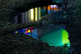
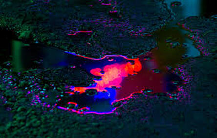
Reflections on Water
Slava Semeniuta
Slava Semeniuta took photos of reflections of neon lights and buildings in puddles. Their photos are interesting because the reflections are slightly blurred because the reflection surface isn't completely flat, making a distorted reflection. I love how the bright colours pop through the dark background and there's a small glow around the puddle, meaning there's an even more distorted reflection on the ground. My favourite photo of theirs is the middle image, because I like how the bright, warm, neon pinks and reds contrast to the dark, cool blues and greens, creating an interesting effect that grabs attention.
|

|
|
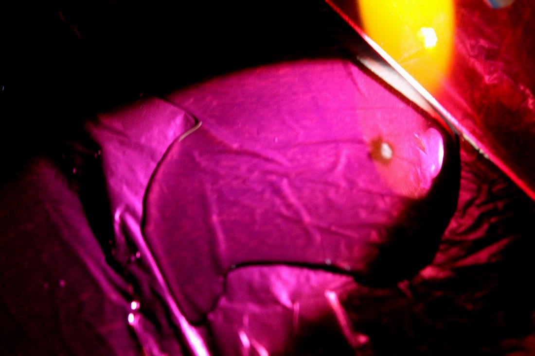
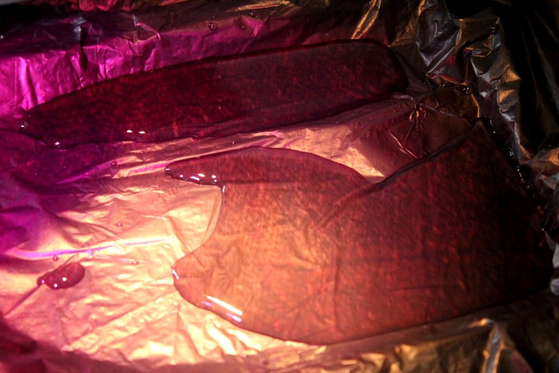
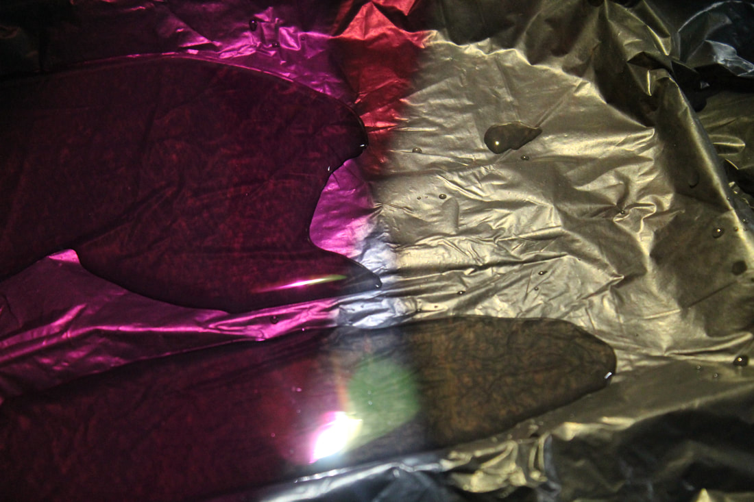
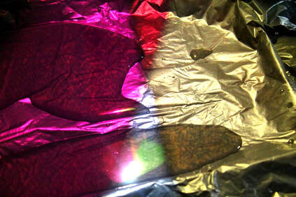
Following looking at Semeniuta's photos, we filled a tray with water and used different coloured plastics and torches to reflect different colours onto the water. At first, it was difficult to get the right camera settings, angles, and lighting for the photos to work best, but after a while I found the ones that worked the best in my opinion, and after that I love the photos I got, as I really got to experiment with many different colours, perspectives, and even things like the way the water was filled in the tray. To further extend the photos, I would use more colours on each image, because the photos that were multicoloured were my favourite of the ones I took. I would also love to try doing the reflections in puddles, instead of in a forced environment, but that seems much more difficult as there would have to be the right puddles in the right places, and it would probably only work well enough if it was dark, so the colours being reflected would show up best.
|
|
|
|
|
|
WWW: The photos look original and quite metallic and retro in some of them, which I think works very effectively.
EBI: I could try using more water or maybe some mirrors to create a layered reflection.
EBI: I could try using more water or maybe some mirrors to create a layered reflection.
Artist and Me
SLAVA SEMENIUTA |

MY RESPONSE |
I'm very happy with the way my response to Semeniuta's work turned out, as I think many of the photos captured a similar essence of the bright and bold neon colours on the water. I would love to try taking photos that capture this same idea but in puddles, just like Semeniuta did. However, I do like how my photos aren't too similar to hers, as the reflections of the colour on the black sheet added to the reflections through the water, making the photos seem more layered and interesting, in my opinion.
Visual Brainstorm

Semeniuta's photo
|
|
My response
|
The edit
|
|
3 Strands
Craig Cramer/Alvin Langdon Coburn
Pol Úbeda Hervàs
David Samuel Stern/Jean Faucheur
Pol Úbeda Hervàs
David Samuel Stern/Jean Faucheur
David Samuel Stern
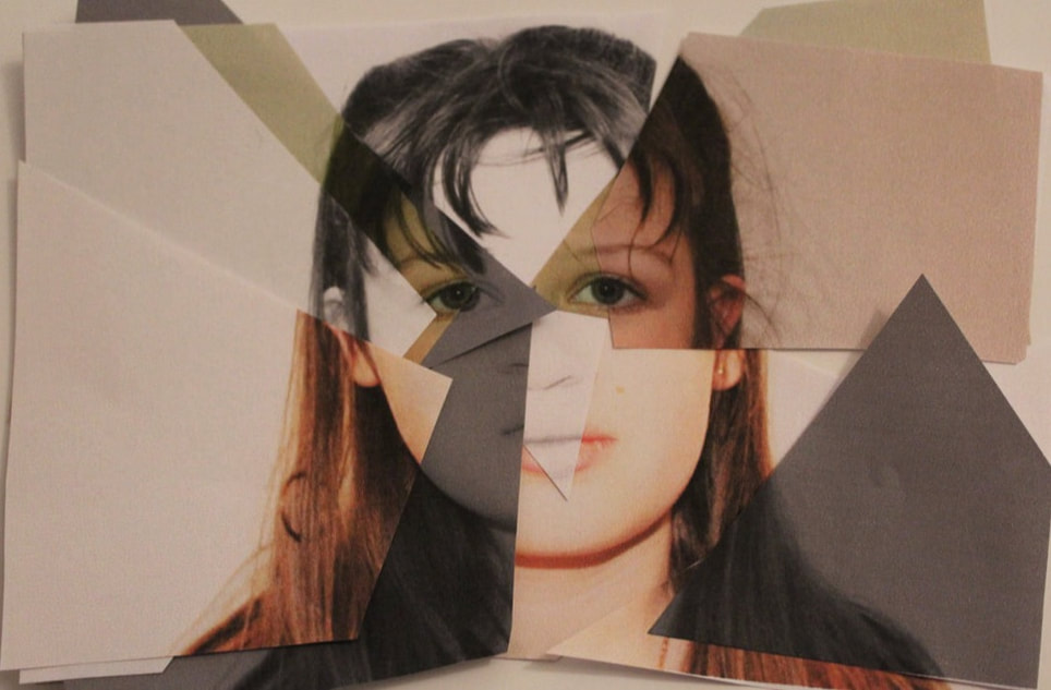
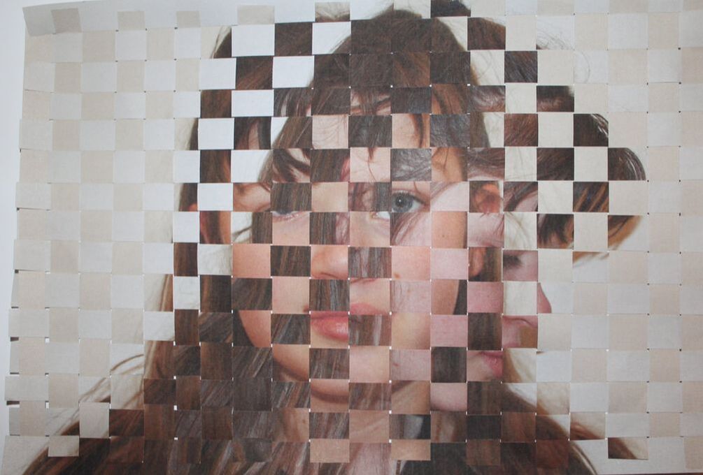
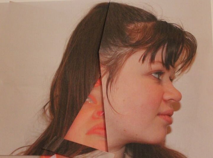
Stern takes two images and weaves them together, showing one slightly less present and more like a reflection of the other photo. I really like their work as their simplicity represents a different type of reflection, and also slightly confuses viewers as they may struggle to understand how the photos were formed and created. I think the most effective thing about them is the plain backgrounds, as they make the photos speak louder because you don't shift your focus onto something different. The lack of bright, neon colours adds to the simplicity as. it creates images that are more faint and that stand out because of the actual images, not just the tones and colours. I think the layering of the photos not only shows two sides too people or a reflection, but it also creates a blur about the image and therefore captivates viewers even more. I was inspired by their work as I was interested in creating a strand that could be edited purely on photoshop, but I would create the edited effect in real life by printing out the images and weaving them together. To me, that feels more creative and individual than creating something with the same effect on photoshop, and it does link back to old ideas and methods of editing photos before computers were invented, which further adds to the simplicities of the photos.
|
|
|
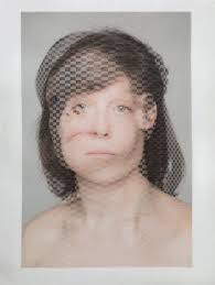
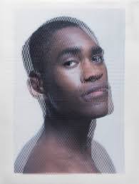
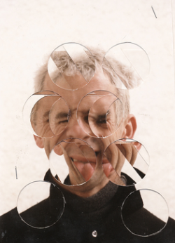
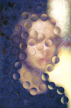
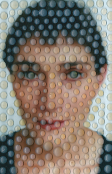
Jean Faucheur
Faucher's photos are also interesting as unlike Stern, they use just one photo but either layer it or cut parts out and flip them round. creating these would be more difficult than creating something similar to Stern's, as it's more difficult to create these neat circular shapes which add to the image so well. As you can see, in the first photo they used many copies of the same photo and stapled them together, creating layers and layers of different parts of the same photo, each cut out to reveal another part of that photo. All of their images are interesting as you can't tell exactly what's happening in the photos, as they are blurred and distorted too much to clearly see, which I think is really effective as it distorts it a lot. In the last photo, it looks like water droplets on the photo which blur the image and create a distortion. I think a similar effect could be created by cutting out the bubbles in bubble wrap and placing them on different parts of the image, maybe even painting the base of the bubble a certain tone or shade that almost matches what is in the image behind it. Overall, I think I prefer Stern's images, as they are more coherent as a set and I think the further simplicity makes them more original and captivating, however Faucher's are still fun and interesting to work out and look at.
|
|
|
I tried to do a weaving style as a response to Stern's set of photos. I love the way it turned out however it was very time consuming to make it. I think that it would've probably worked even better if the strips of paper were thinner, but considering how long it was already taking, it would've taken much longer to do even if it would've required thinner slices of paper. If I were to develop this strand further or use it as a final piece, I think I would've taken the time to make it perfect and therefore more similar to Stern's style. For my other response to this strand, I cut up one photo so it was slightly distorted and left a gap underneath, where I placed another image that I'd previously edited on photoshop before I printed it to alter the colours. This worked well but I think it could've worked even better with more layers and colours. To develop this again, I would like to print out the same photo many times but with different shades, tones, saturation etc. and cut different pieces up to make the final photo, but with all sorts of different shades and colours. Update - I developed it again with this development, and it worked out really well. I would love to try one with different colours as well as just shades.
|
|
|
Artist and Me

David Samuel Stern |

My Response |
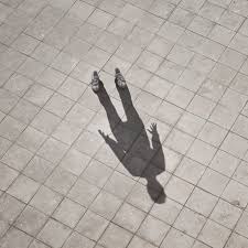
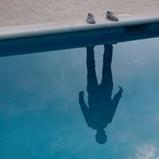
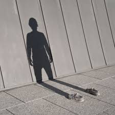
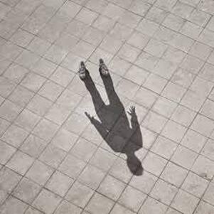
Pol Úbeda Hervàs
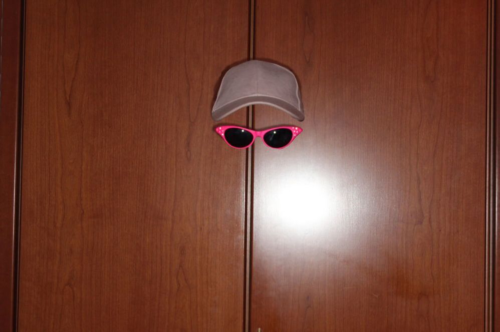
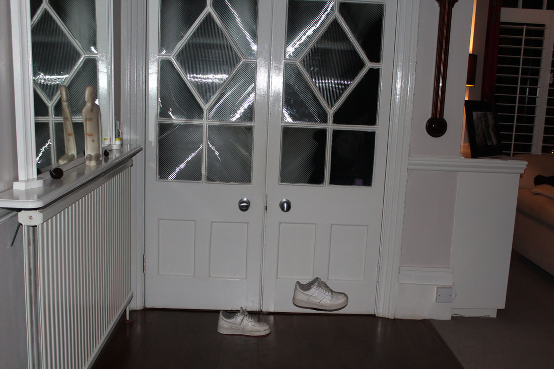
Hervàs' photos show a reflection that looks almost supernatural and extraordinary. I think the use of having simple backgrounds works effectively as it takes peoples minds off of anything other than the simple reflection that is present in the photos. The mystery behind who these figures are captivates the viewers, as the only thing we know about them is their shoes, which keeps the curiosity and mystery alive as no one knows who was in those photos. I like how Hervàs uses a sense of natural vs supernatural in the photos, as although we can tell it's a human shadow, there's still something ghost-like about the photos, as there is a shadow but there's no one there to create the shadow. It also represents an isolated feel, as there is just one shadow and nothing else. It could reflect a sense of invisibility layered on top of the isolation, as it shows someone who is present but also isn't seen or noticed by others. When developing on this strand, I would love to keep the originality of the images, but also to change some things, for example, I could edit out everything except from a hat. Therefore, I could show inspiration from Hervàs without directly copying the work, and I can make it more of a development and something that is my own.
|
|
|
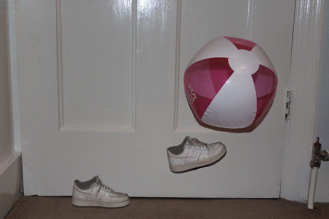
I found it difficult to recreate Hervàs' exact style, as when I did this project, it was winter so there were never really shadows anywhere. However, I decided to do a similar strand inspired by their work, by editing out the model and just leaving certain parts of clothing and accessories in the photo. I enjoyed making them on photoshop and when I found out what worked best when making them, I really liked the outcomes of the photos.
|
|
|
Artist and Me
Pol Úbeda Hervàs |

My Response |
Multiple Reflections
Craig Cramer
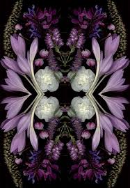
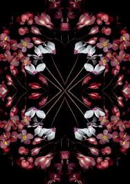
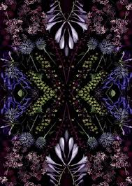
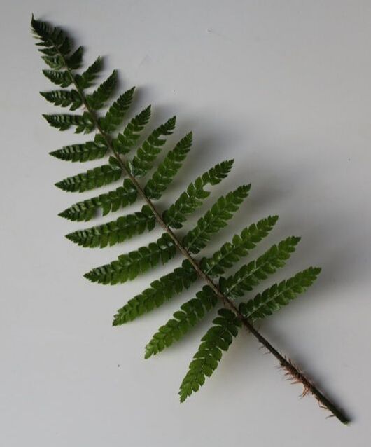
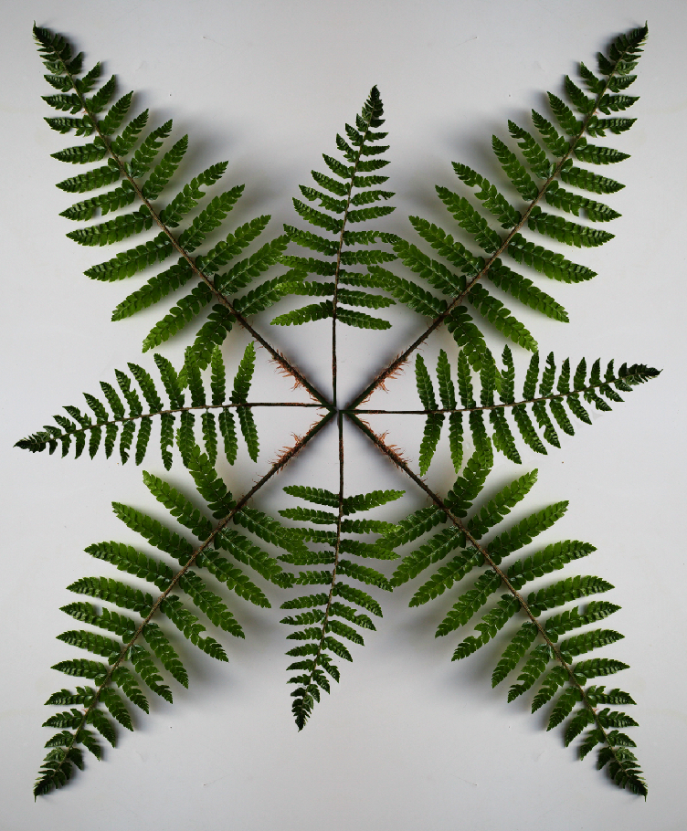
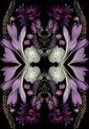
Cramer's photos are captivating because the bright colours of the flowers contrast to the dark, plain background. This makes the focus of the photo lean towards the flowers and plants completely, meaning the audience are drawn in and captivated right from the start. I particularly love the middle image here as the detailing is so perfected, for example the stems of the flowers all meet in the same points, making it pleasing to look at. I also like how Cramer chose different plants that have colours that compliment one another, as it makes the audience more drawn towards the photos. I love the fact the photos use interesting, pastel colours as I think the bright plants and flowers look effective. I was inspired by Cramer's images as I like the idea of reflecting plants through photoshop, and creating something more abstract. Their photos are some of my favourites as it shows a simplicity, however is still super effective and shows some individuality and uniqueness. Overall, I think the edits are just captivating to look at and are easily understandable but have a peculiar edge to them.
|
|
|
Alvin Langdon Coburn
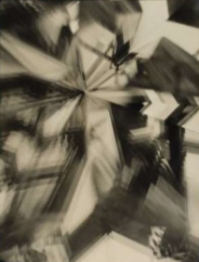
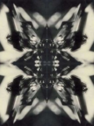
Coburn's images are also interesting as I love the way they're still multiple reflections of an image, but these ones aren't as neat as Cramer's, and instead they give the effect of a shattered mirror which I think works well in the photos. Also, as these photos were taken early last century, the colours are more bland which gives it a real, more rustic appearance, which I think I would love to develop on, rather than the more colourful, vibrant images that Cramer took. The tones are a mixture of warm and cool which plays with your mind a bit, and I think it gives it a much more interesting feel which is another reason why I'd want to develop on these. Coburn's photos are also much more abstract than Cramer's, which I do like but I think I prefer the way Cramer's look in this sense, as I enjoy knowing what the image was taken of, because it makes it more interesting to see the transformation. It would be fascinating to see what the original photo was, as I think these are so abstract that it makes you wonder what is actually going on in the photos. However, I do also like the mystery behind what the original image was taken of, as it leaves you curious and creates a mysterious aura around the photos.
|
|
|
Horst P Horst
Horst P Horst did a project called 'Patterns in Nature', where he would physically reflect photos of nature by printing them out and taking a new photo with all the printed copies beside each other. I think these photos are more abstract and unusual, which I think works very well. I like that the photos are in black and white as it shows a kind of simplicity to the photo and brings out the patterns more, directing the focus away from everything but the patterns and shapes. I think they're interesting as they create the same effects as the edits in photoshop, however these were made physically, showing how photography in the past has influenced photography in the present, and it also represents the change and growth in photography, and how technology has helped develop photos and editing while also allowing a way to create the same effects as traditional photography, but in a way that speeds up the process and makes it easier, and with more refinement. I think the most interesting part of Horst's photos is thinking about how photographers have been capturing images like this for ages, without any of the useful tools, such as photoshop, to help edit the same effect.
|
|
|
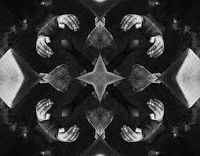
Dmitry Zakharov
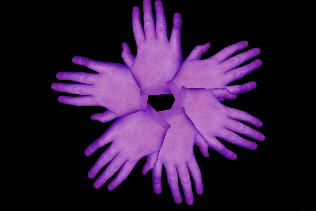
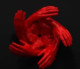
Zakharov did something a little bit different to the other artists, as instead of using nature, they used body parts, mainly hands. I love these photos as they're more original and peculiar to look at. I particularly love the middle image with the red hands and faces, as it's quite strange to look at but it's captivating. I love the dramatic boldness of the red in contrast to the blank background, as it makes the hands seem like they're floating through nothing, creating a feeling of isolation and as if the object is surrounded by absolutely nothing. This creates an interesting effect as it adds another layer of curiosity and wonder to the photo, further captivating viewers. The other two images are more similar to what I would like to achieve from this strand, and I think it would work well as a development as it's very different to just reflecting plants, because you're photographing and editing something more alive and it makes it seem as though the photo is more alive, creating an effect of movement without actually moving anything at all in the photo. These images inspire my strand a lot as they're something slightly different and although it uses the same process, it produces an overall image that is nothing like the work of the other artists. I think out of all the photographers, Zakharov's work is my favourite as I just think it's very unusual and unique, which I really enjoy.
|

|
|
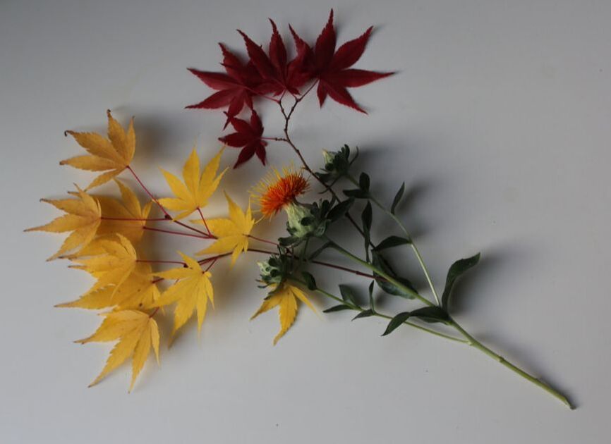
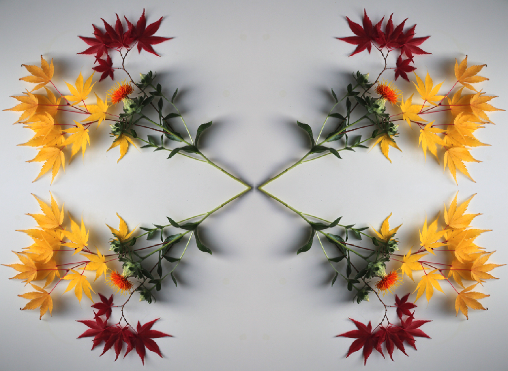
For my response to the artists' work, I created my own reflection edits using photoshop. Although I love all of their images, I preferred editing work similar to Cramer's, as I preferred their style overall. Therefore, I made mainly only edits inspired by Cramer, as I found it more fascinating to create and they overall turned out better. However, the others influenced them as well as for some of the developments, I tried to create more abstract work as I love that you can decide yourself what you believe the photo is really of.
ORIGINAL: |
EDIT: |
|
|
|
|
|
|
|
|
|
|
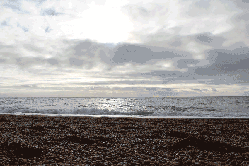
As an extension, I was aiming to create a GIF that showed the reflection of the sky and clouds onto the sea. However, the day I took the photos was cloudy so didn't work as well as I had hoped. To develop this even further, I would've loved to make a GIF from these photos but reflected, taking the idea of the multiple reflections and the actual reflection on the waves. This would've been very time consuming, as just taking the photos for this GIF took about an hour, and then it would use a lot more editing to create a reflected GIF. I still like how this GIF turned out, and would love to see how it would work on a nicer day. About half way through taking the photos, my camera got slightly knocked so the GIF jolts a bit. To fix this I could be careful and use a tripod instead of just laying it down on the beach.
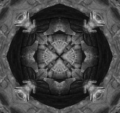
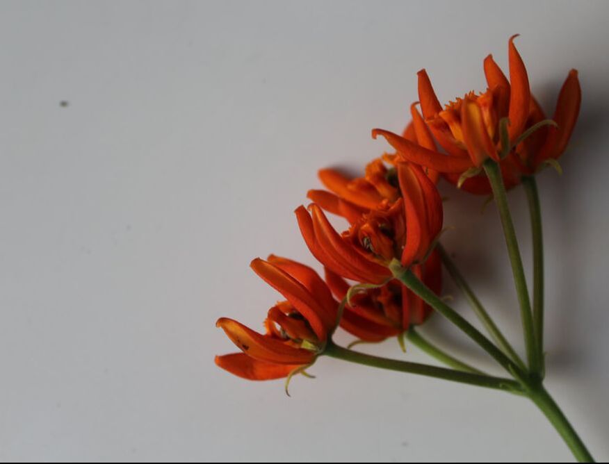
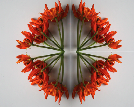
I further extended this strand by taking inspiration from Dmitry Zakharov, and I made reflection edits of hands instead of plants. I edited the colour of the hands too to make it more interesting and unique. I put the edits on plain black backgrounds to ensure all focus remained on the edit, and not on any other minor details.

Visual Brainstorm
Cramer, Horst, and Zakharov's photos
|

|
My response, edited
|


Final Piece, GIF
|

My response, edited
|

|
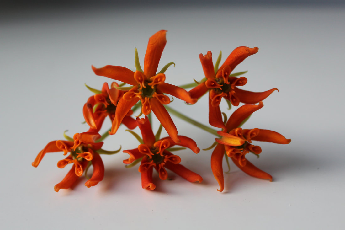
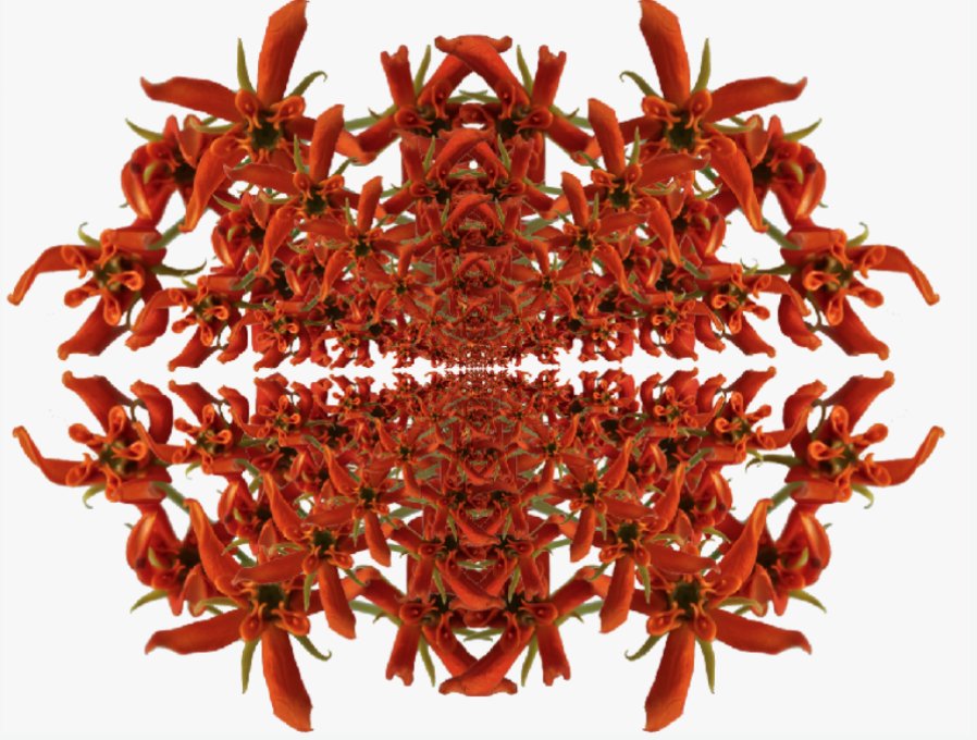
Final Piece
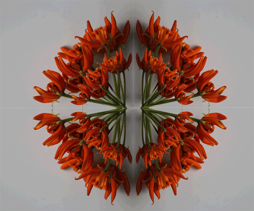
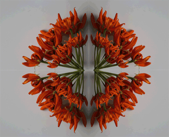
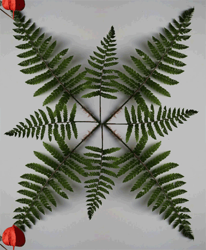
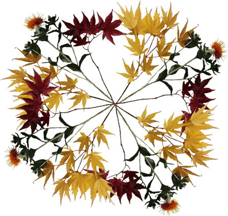
For my final piece, I wanted to create GIFs out of the developed 'Multiple Reflections' strand. These took a while to do, as I had to select the correct part of the image and then save each frame of the GIF individually, and finally, put them together and created a GIF. I like how in some of them, the background stays completely still, making the image look sort of disconnected, reflecting how two things that look similar aren't necessarily the same or similar. However, I did create one GIF where both parts were moving, and although I do love the outcome, I think I prefer it when part of the image stays the same as it looks neater and cleaner. I also tried doing half of my GIFs with a grey background (the one I took the original photos on) and then I did the other half with a white background using photoshop to see how the final project would look with both colours. I think the white background makes the GIFs look cleaner and neater, however I do like the shadows that are created by the grey background, as it makes the images less abstract and brings them back to reality. I love these GIFs as they are simple and they develop on the strand, but they also take a long time to create precisely. Focusing on the smallest details (like removing every single dot of background colour that I didn't want) was the most time-consuming part of making these GIFs, but they do make the most difference to their quality, as they appear neater and more professionally made, which shows how spending a bit more time on photoshop than I had to payed off, as the GIFs look much better because of it.
My favourite GIF is the one with the orange flowers and the spinning centre, as although it probably took the longest time out of all of them, I think it turned out the best as it's simple but very effective. It also shows every aspect of reflection that I wanted to portray with these GIFs, which shows how the simplest and most standard ideas can actually turn out to create the best work. I think all of these GIFs portray the reflection I wanted, and I am very proud of the outcome of my work.
If I was to develop on this even further, I would try to combine the different ideas from the different GIFs. For example, I could take the main ideas from the two GIFs involving flowers - having the middle section spin and get bigger and smaller. I think this could work very well because although it would take away some of it's simplicity, it would still look simple and neat even if it would be more complex to make. It could also represent the many layers of reflection in our society and show that everything we see has not only two sides to them, and there's actually a lot more going on.
I did make edits of all of them with white backgrounds to see if they would look better as a collective, but I decided that I preferred them being separate and so decided to leave them as two white backgrounds and two grey backgrounds, as I believe it looks best like that.
