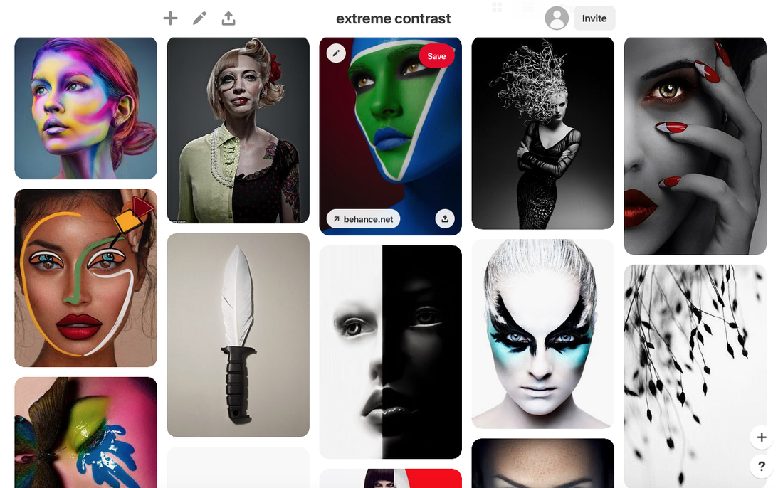
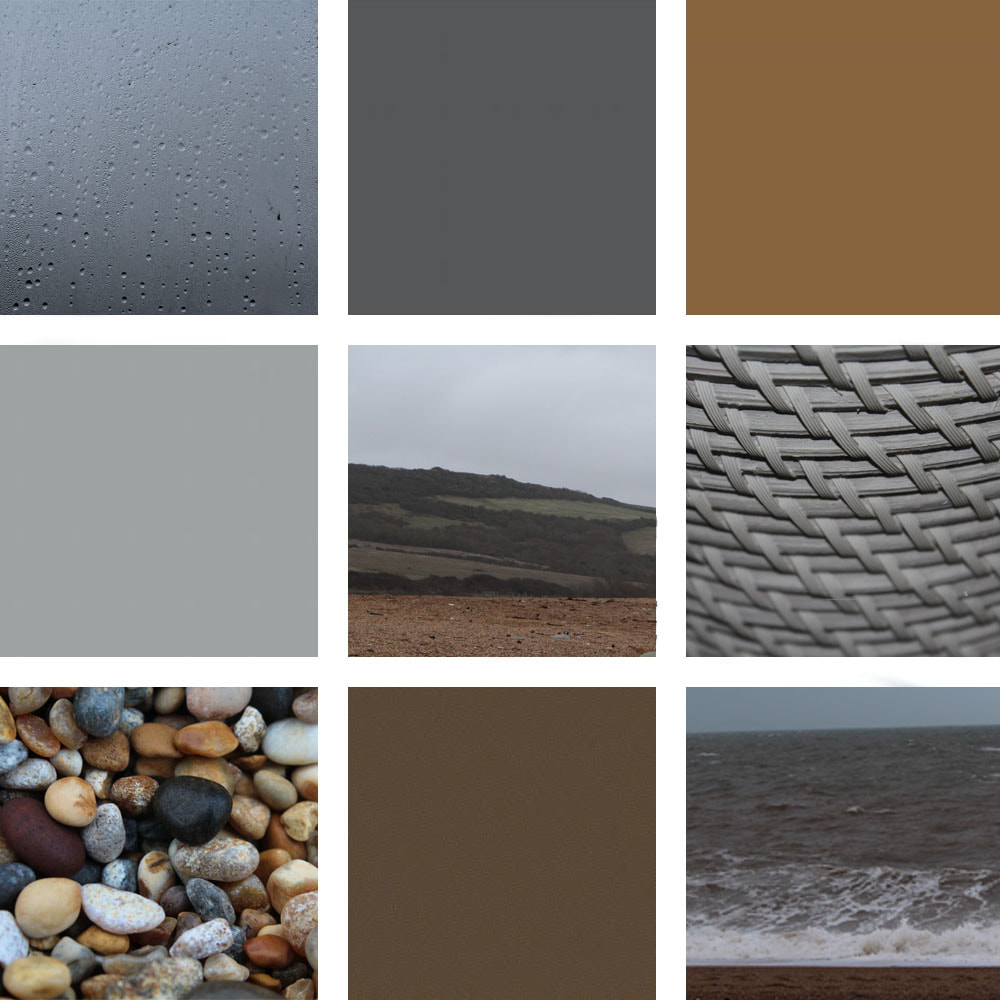
Extreme Contrast Pinterest Board
Photographers Gallery
We visited this gallery on a trip, and we saw the 'Shot in Soho' exhibition, with different photos of people on the streets and in various locations in Soho, and the 'Feast for the Eyes - The Story of Food in Photography' exhibition, all about how food has been presented in photography throughout time. I think that overall, I preferred the 'Feast for your Eyes' gallery, as I found it interesting how different photographers used food to enhance and add to their photos. I also loved how a lot of the photographers edited the photos of food, as it was amazing to notice how the different foods had changed from how they looked in real life.
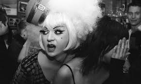
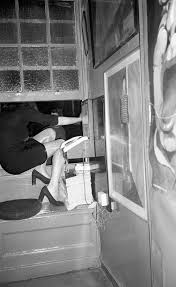
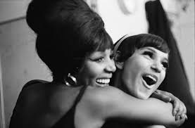
Shot in Soho
Shot in Soho is an exhibition that celebrates the history and diversity of Soho's culture. Many of the photos taken show different people, lifestyles, and locations which further enhances the wide variety of different areas in Soho. I noticed how most of the photos were in black and white, which I found really interesting because although many of the photos were really different environments and people, the black and white edits felt like they were erasing some of the differences and showing that although we have differences, we are all more similar than we think. Overall, I really enjoyed this exhibition.
|
|
|
I love the variety of images we saw at the Shot in Soho section of the Photographers Gallery, as I think it showed truth, the past and the fun going on behind the scenes in Soho. It was particularly interesting to see how many of the images related to each other in some way. However, I think that all of the photos showed something different about the area, and it really amplified the differences between people in different countries, places, and even in different areas of Soho. It's interesting to see the different types of people, different lifestyles, different relationships, and different environments all inside of this one area. Soho is an area that is generally hidden away from most of London, and it's structure is the same as it was in the past, so it's exciting to have a peek into what life is really like in Soho for many different people.
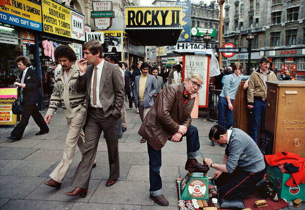
by William Klein, 1980
This photo by William Klein really stood out to me at the exhibition for many different reasons. Initially, it caught my eye because it was one of the few images in colour in this section, so it immediately drew attention to itself. Not only that, but it's interesting viewing the different location, fashion, types of people and relationships between people. For example, the man having his shoes shined shows some superiority over the man shining his shoes, and there are even many people in the background of the photo looking at him, possibly looking down on the shoe shiner, or maybe feeling jealous of the person having his shoes shined and his lifestyle. There are more relationships as you see the two men walking together, unbothered about people around them, perhaps showing that they have a good connection and are having an interesting, captivating conversation. It's also interesting to see how the majority of people in the photo are men, and all with similar styles like a suit or a jumper with trousers that flair at the end.
Feast for the Eyes
Feast for the Eyes explored how food has been presented in photography and continues to be presented in photography. It was interesting to see how one item of food can completely alter the way a photo is viewed to many different people. Loads of different photographers all used food in different ways to show a range of themes, questions and viewpoints, some political and some more simple. A lot of the photos ended up in a very abstract way, for example while I was looking at some of the photos, I knew it was an item of food being photographed but it was often difficult to work out what that item of food was, or how they managed to make that food item look so different to the way we're used to it looking.
|
|
|
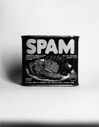
This section of the gallery was so interesting to visit, as at first you see food being placed in different photos and different edits and you don't think much of it, however after reading about all of the photo descriptions and really understanding what messages the photos were really trying to convey, it made every piece much more interesting and clear as to what they were portraying. The most interesting photos for me originally were the intricately edited ones with peculiar compositions, but as I went through the gallery I found the ones like the spam photo really fascinating, as the photographers were using food photography to play with peoples senses. I found that while looking at some of the most simple photos, you could smell the food, taste it, feel it, and you would start to crave that particular food item, all while simply looking at a photo. This really emphasised to me how much food can transform a photo, and I really appreciated seeing all of these images.
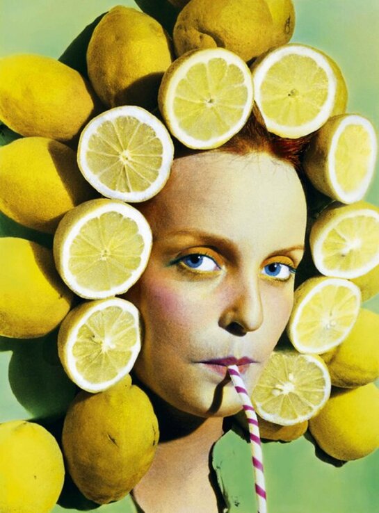
by Ouka Leele
I think this photo is effective because the colours all compliment each other very well. The framing of the photo works as they slightly used the rule of thirds, making it more interesting to look at. I like the way Leele used the colours of the makeup to match and in some parts, to contrast, with the colour of the lemons that frame the face. I also think the use of pastel colours is really effective as it draws a lot of attention to the photo without making it too overpowering or bright to look at. It was taken after Franco's dictatorship in Spain, showing a sense of freedom as he wasn't ruling anymore. This is displayed through the colourful tones and the fun aura presented by the photograph. It represents someone feeling free and expressing themselves after being controlled and pushed away for so long. I think this adds further interest to the photo as it shows how food can express something free and fun, and it can be manipulated to add so much to one photo. After finding this out, I started to find this photo a lot more fascinating.
3 Artists
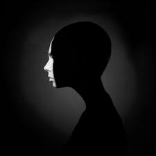
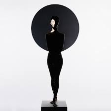
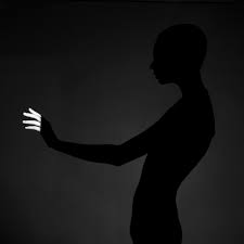
George Mayer
Mayer's photos are captivating because of the simplicity of the contrast, as it's only between black and white. My favourite photos are the two with the black backgrounds, as I love how the only parts of the photo you can see is the outline of the person's silhouette and the tiny bit of light shining on them. I love the use of negative space, as it works effectively because it makes the photos mysterious and intriguing. The photo in the middle with a white background is satisfying to look at, as the circle in the background and the figure of the person are neat and cleanly edited. It's interesting to try to figure out how they created that effect, as the figure is completely blacked out, however the rest of the photo is mainly white and bright. I think that I'd love to take inspiration from the simplicity of these photos, as it's such a simple contrast and concept but it works really effectively.
|
|
|
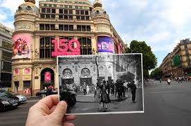
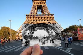
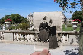
Julien Knez
I love Knez's photos as it's interesting to see how much similarity there is in the architecture of the buildings, but there are huge differences in the people and society. They're particularly interesting because the contrast comes in many different ways: in the colour; in the time; and in the way people live. I think these photos are really captivating as you can tell how culture, fashion, and people have changed throughout time, but I love how much the architecture and buildings look the same, as it really shows you how much things have changed and grown, but it's definitely in the same locations. My favourite photo is the one with the Eiffel Tower, as it shows similarities through how there are still people visiting the tower and the structure of it is the exact same, but almost every other aspect of the photo is different.
|
|
|
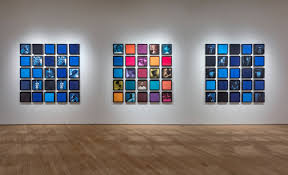
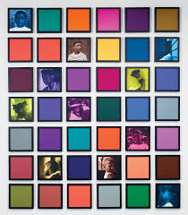
Carrie Mae Weems
Weems' photos are some of my favourites, as it's fascinating to see how much one colour scheme adds to an image. I particularly like the blue one, as I love how it looks organised and well made but as you observe it for longer, you see the messy side, with all the different tones and shades of blue and the random selection of photos scattered about the collage. I would love to create my own response to this as I love how it looks as a collective, and I do a lot of photoshop work with altering colours so could do something really effective with this. I like the random colour scheme on the middle photo, as it's effective to have some of the colours, tones, and shades clash slightly. In the photo of it being displayed in the gallery, the middle one pops the most as the blue ones are calming and all the photos and colours work together, whereas the middle one is scattered and looks like it almost fits in with the set but not quite.
|
|
|
My response to the 3 Artists
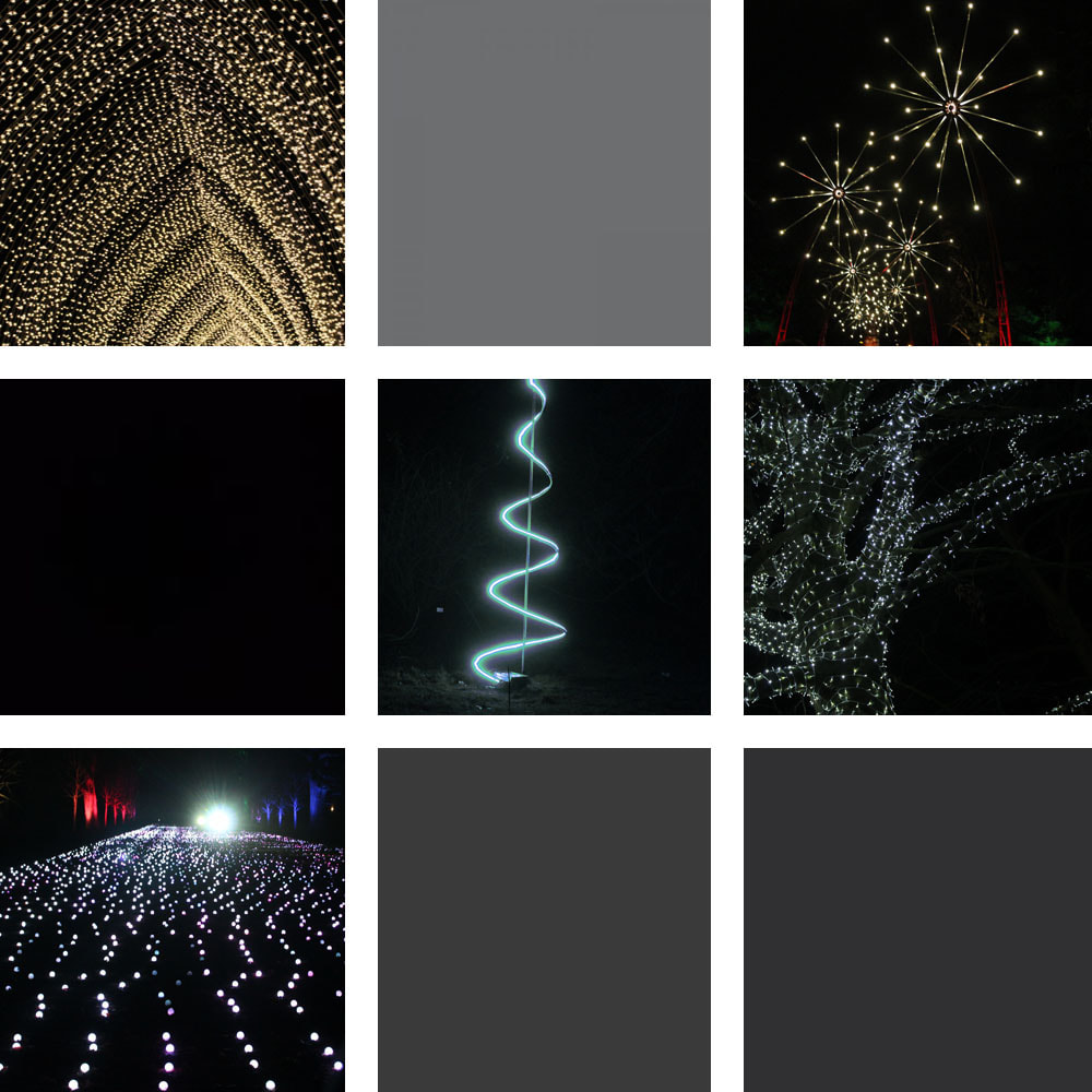
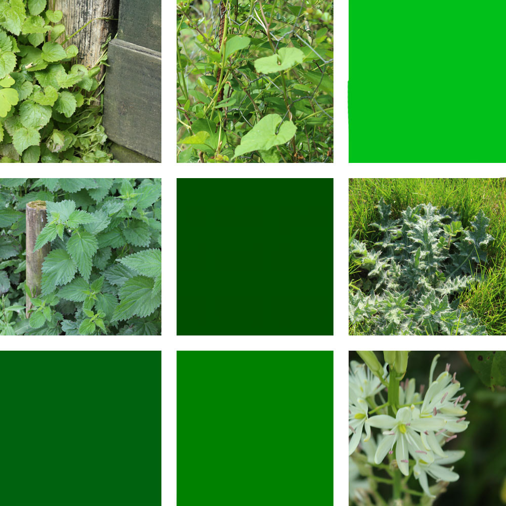
Grids - Response to Carrie Mae Weems
I was greatly inspired by the work of Carrie Mae Weems, as I loved the way her photo collages looked and I thought it would be interesting to create my own response. To do this, I took a variety of photos in different locations but with similar colour schemes, and I placed them into a grid, filling in the gaps with block colours that fit with that colour pattern. For the dark grey collage, I took photos at the Kew Garden light show. These photos were all similar as the dark sky and the bright lights appear in all of the images. The green photos were taken in different outdoor locations around London and Dorset, so I got a variety of different plants and nature to fit into the grid. Finally, the neutral colour photos were taken of some household objects, and others were taken at beaches in Dorset. I think the variety of different locations and subjects in the photo make the different grids more interesting, as each photo is different and yet they still all work together to make one collage of images. The contrast in these photos is present in the difference between the white lines and the colours and tones in the photos, and between the differences between the squares with photos and the squares which only contain block colours. Also, particularly in the collage of lights, there is a contrast between the lights and the black background of the night sky.
|
|
|
WWW: I love how the grids turned out and I think they worked very effectively
EBI: If I made a collage with more photos and colours in it, and maybe one huge collage with sections of different colour schemes.
EBI: If I made a collage with more photos and colours in it, and maybe one huge collage with sections of different colour schemes.
The photoshop process of creating these wasn't too difficult, as I downloaded a 3 by 3 grid from the internet as a guide to where I would put the photos, and once I had all the selected images and colours in the right places, I used a tool to create the white lines to neatly separate each photo, making sure that the width of each line was the same size. This transformed the collages, as it made every edge neat and crisp and also clearly separated and clarified each image in the grid.
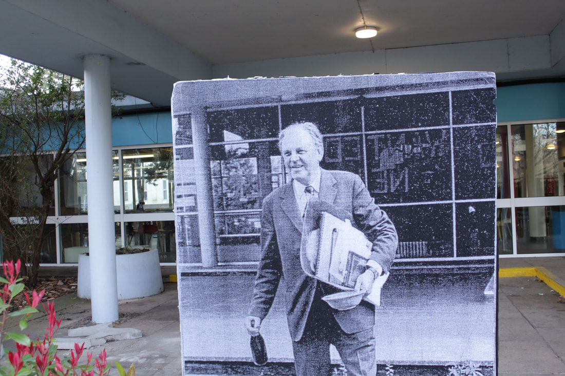
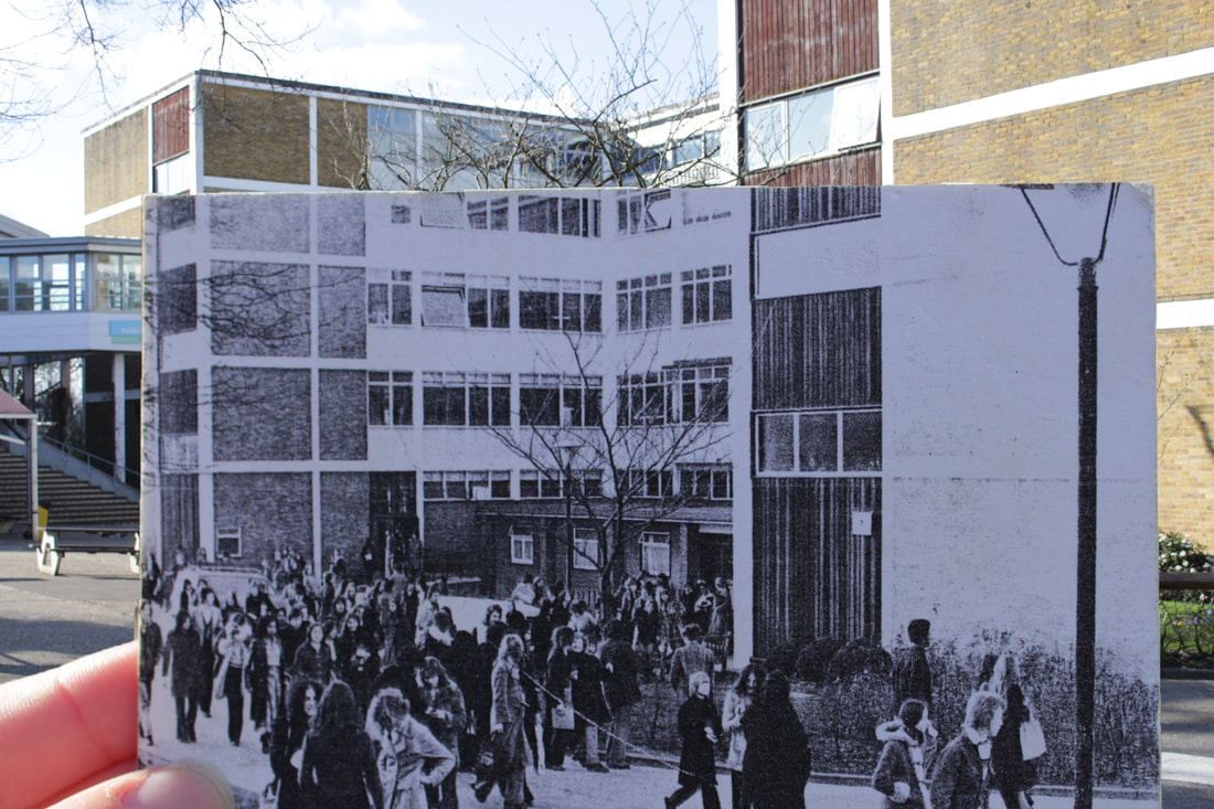
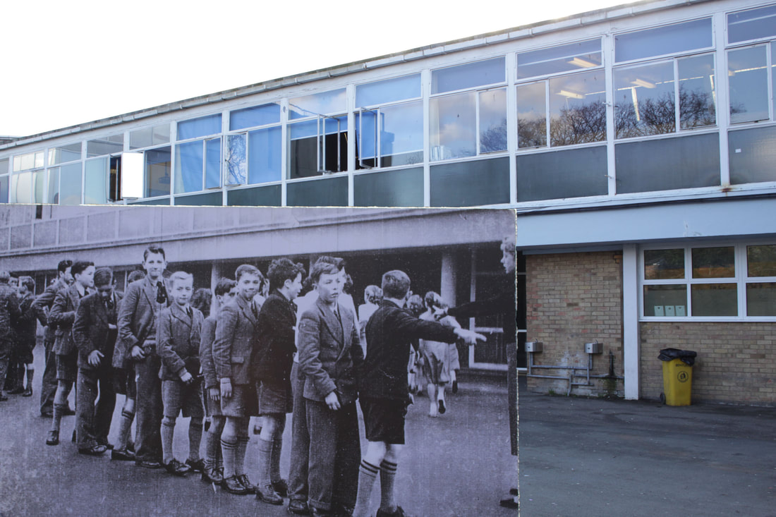
Old vs New - Response to Julien Knez
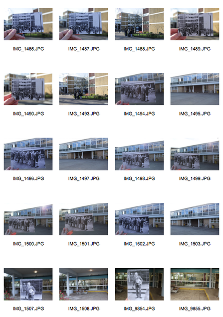
To respond to Knez's images, I got some old photos from around school and took photos of them in the same school environment and background. I found it interesting to see what things were like in the past, but it was hard to position the photo right to match up in every point, as you had to get the sizing, the distance and the positioning correct for them to work well enough. I think they turned out pretty well, but I would like to get some more photos in different environments and try to match up completely where the old photo was taken, as I think one of the main things that makes Knez's photos so interesting is because of how well the architecture adds up and the only real contrast is in the people in the photos, and the contrast between photo quality and colour. Overall, I am happy with how this turned out, but I think there is more I could do to make it match up more accurately to make it more effective.
|
|
|
WWW: It's interesting to see the past compared to the present, and the photos worked well.
EBI: If I could've matched up the buildings in both photos more effectively.
EBI: If I could've matched up the buildings in both photos more effectively.
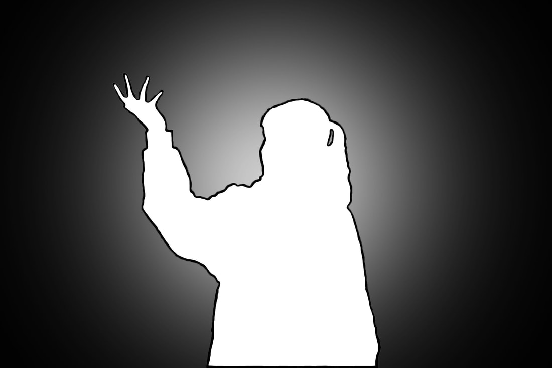
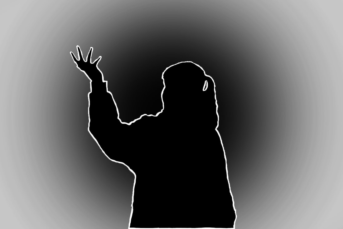
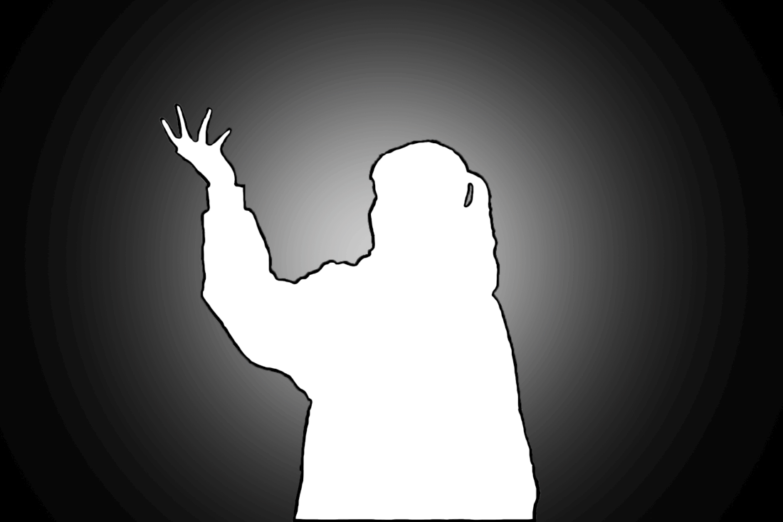
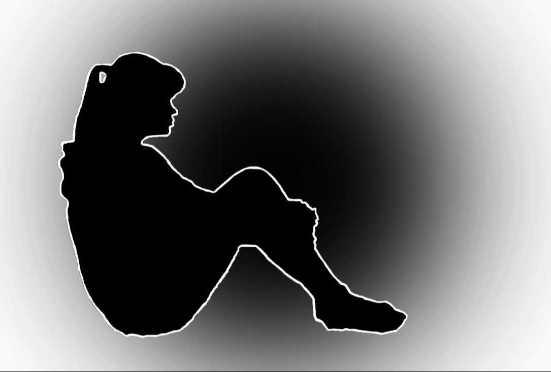
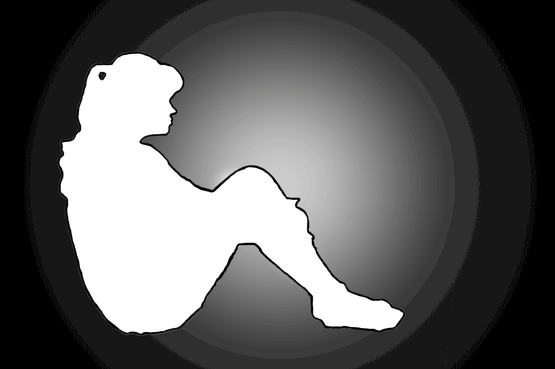
Black and White Contrasts - Response to George Mayer
In response to Mayer's photos, I took a few photos of my sister in interesting positions and giving the photos a distinctive silhouette to work with. Then, I edited the background by colouring it in black or white with a faded circle of the contrasting colour. After that, I selected her and used the brush tool to colour it black or white, depending on the colour of the background. Finally, I traced an outline by using a thinner size of brush. I love the way the edits turned out as I think although black and white is a very simple contrast, it works well and effectively. Also, I feel that with the faded circle in the background and the outlining adds more layers to the contrast as it makes it more interesting and less simplistic and basic. Once I'd made the two edits, I decided to put them in a GIF to not only contrast the black and white within the photo, but to contrast the two photos and where the black and white is placed differently. I'm happy with the way the GIFs turned out as I feel they add even more layers of contrast, and it creates a really effective look to the GIF, as it's interesting to look at and it catches attention.
|
|
|

|
WWW: I love how the edits and GIFs turned out as they work as a simple but effective contrast.
EBI: I would love to make more edits with contrasting colours, not just black and white.
EBI: I would love to make more edits with contrasting colours, not just black and white.
Second Development
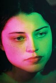
Petra Collins
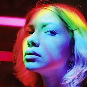
I think Collins' photos are interesting as the different neon colours are vibrant and it works really well where they contrast with each other, like in the first photo with the pink and green. The colours compliment each other well and they create an interesting image with all the different shades and colours in scattered, random places. My favourite photo of theirs is the last one because I think having a lot of different colours works really effectively, and they appear brightly and show up clearly on the models face. I love how some of the colours are taking up most of her face, like the purples, reds, and blues, but the colours like the yellow and the green only cover small stripes along her face, making it really interesting to look at as it's not completely perfect or neat, which I think would ruin the photo.
|
|
|
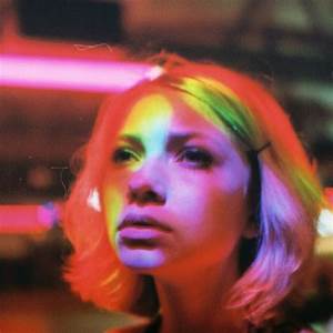
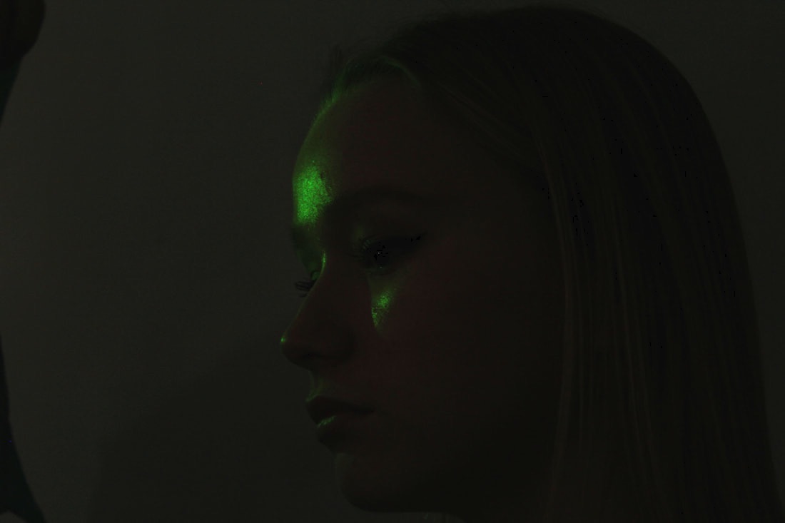
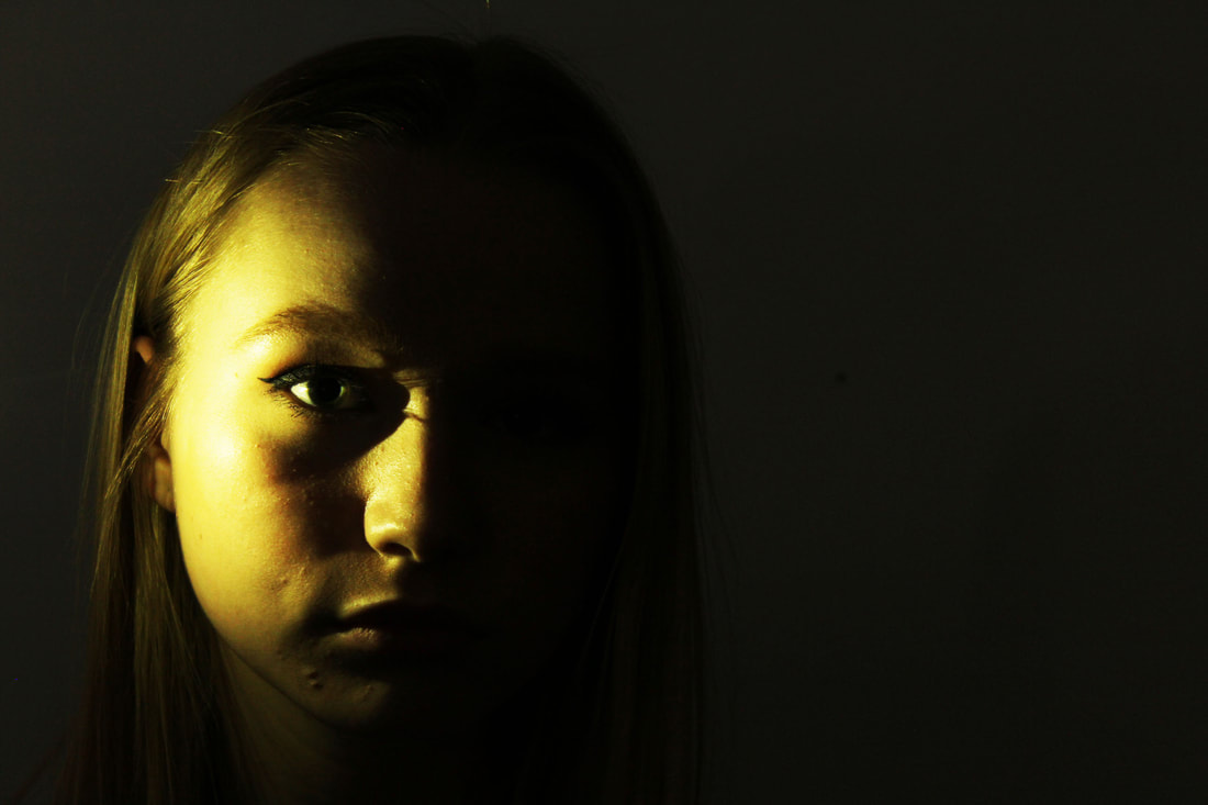
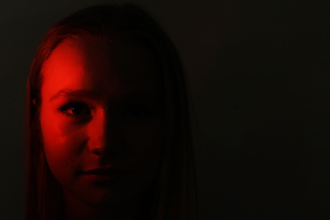
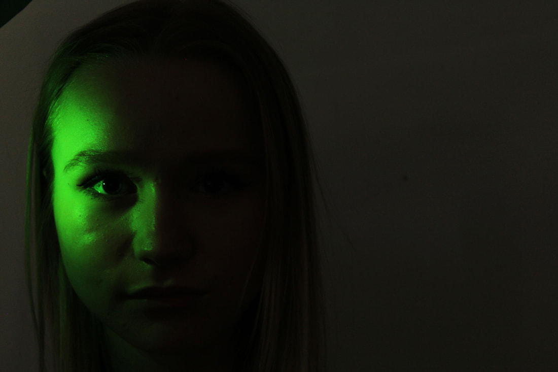
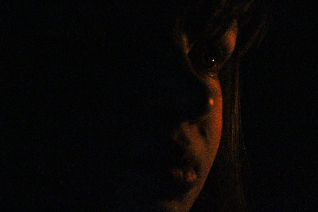
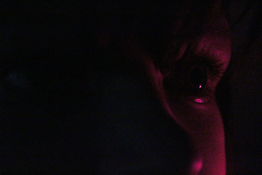
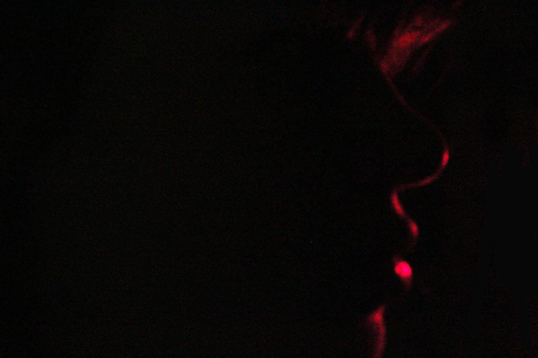
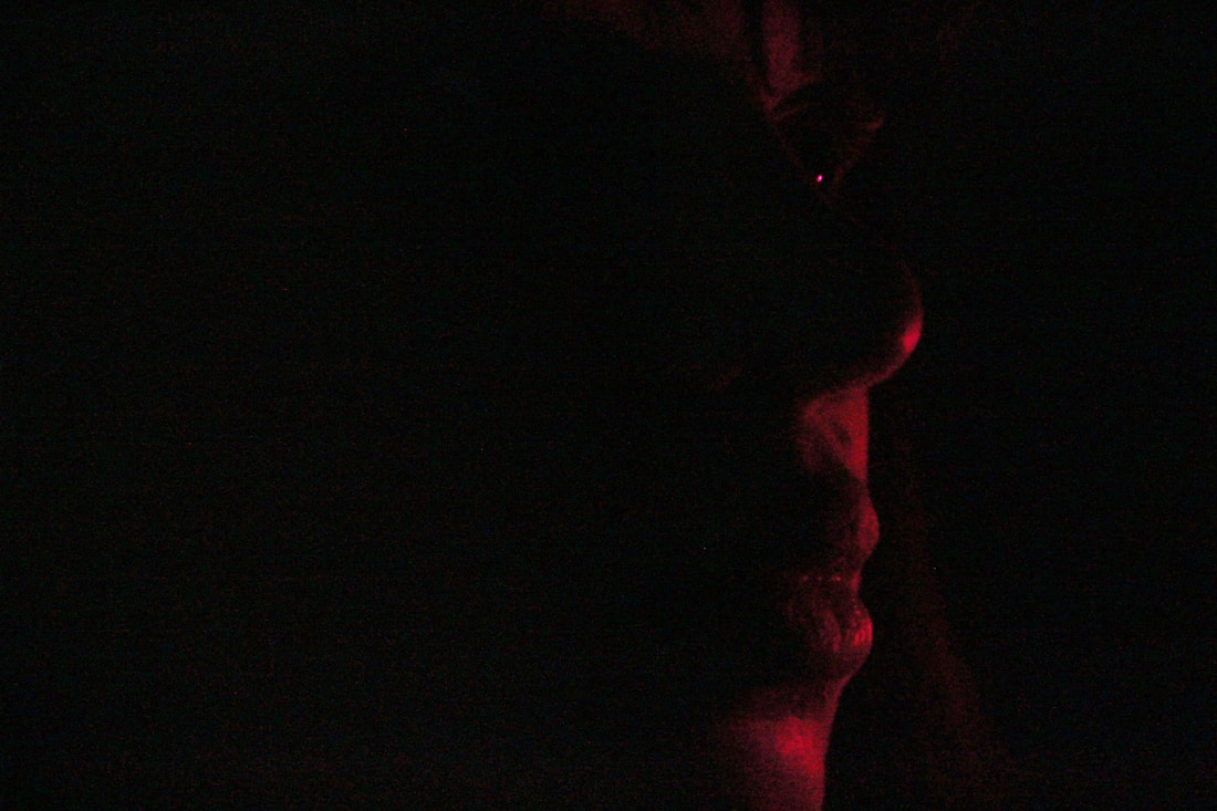
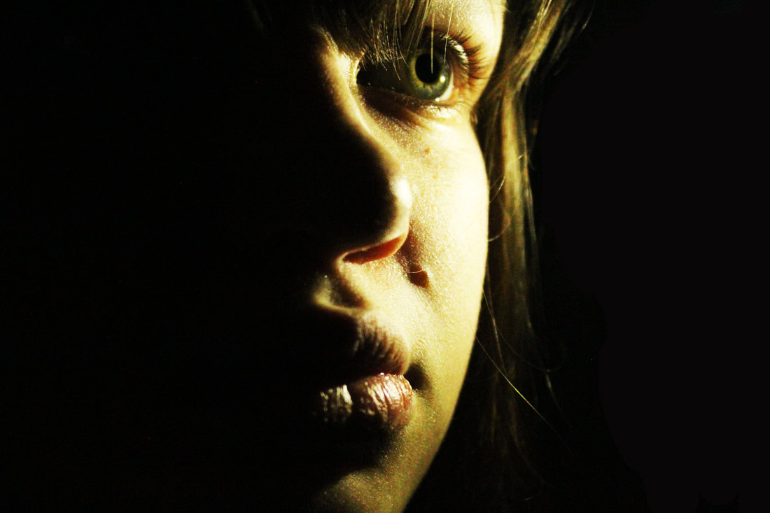
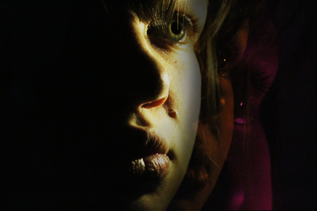
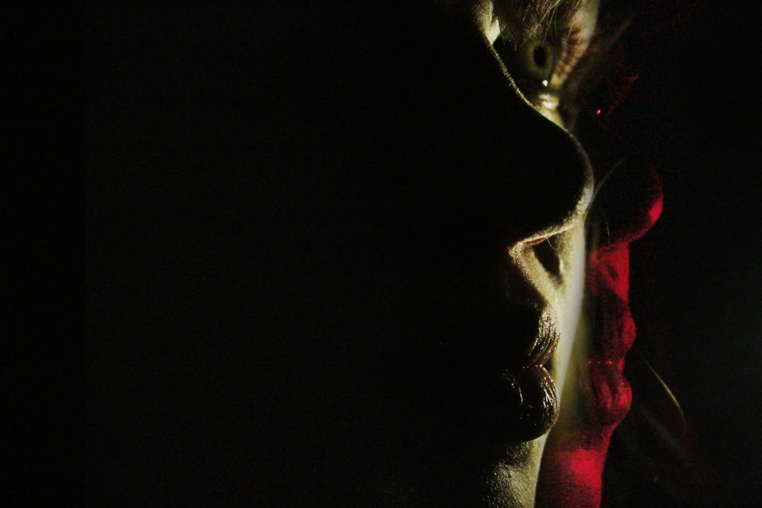
For my second development, I decided to create something very similar to Petra Collins' work where they highlighted parts of a portrait. I did this by holding a torch with different coloured paper over it directed towards different parts of her face. The room was dark and my ISO was low, so I could only capture as little as possible of any part of her that I wasn't trying to highlight by using the torch. These photos came out well overall, but when choosing my favourite photos, I thought it looked best when I increased both the brightness of the photo and the contrast between the light and the dark background. This meant that the brightness and luminosity of the light could be intensified without making the background and the rest of her face brighter in the photo. After editing them, I loved the photos even more, as there was a slightly unusual metallic glow in the photos which worked really effectively.
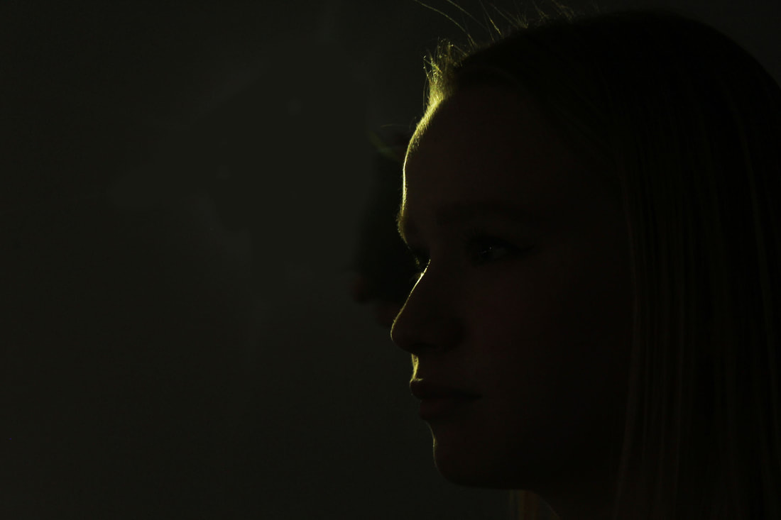
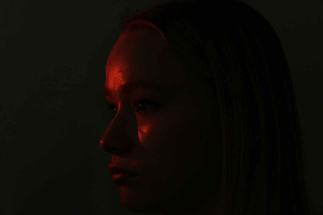
I thought the photos worked really effectively as a response to Mayer after editing, as the photos ended up similar to Mayer's photos where he highlighted just one small part of the photo. I really like the way the light looks metallic and shiny in the edits, as it makes the photos more interesting and unusual to just another black and white contrast. I love the first photo here where only a small line highlighting her side profile is present, as I think it works really well to have the only part of the photo visible be a small slither of light. I think this could've worked even better if there was even more light highlighting her side profile, as it would make it more clear and prominent, allowing outline of the side of her face to be seen even more.
|
|
|
|
|
|
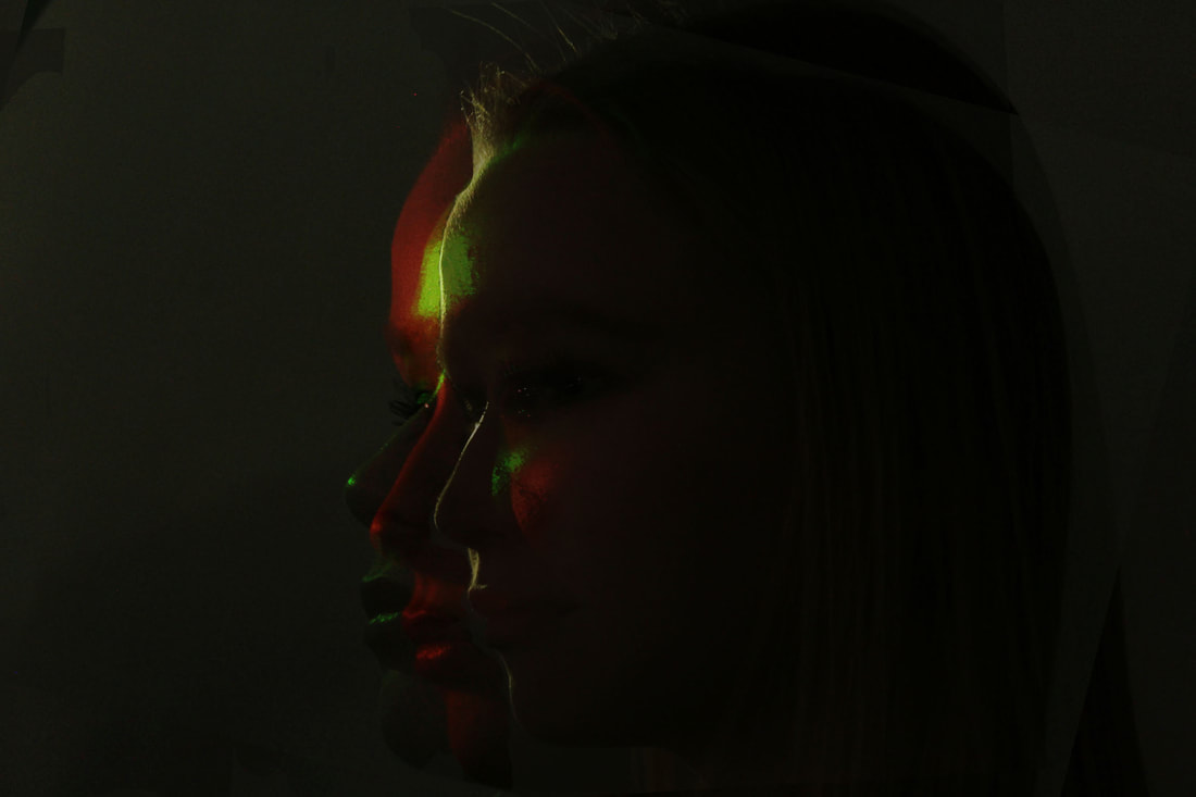
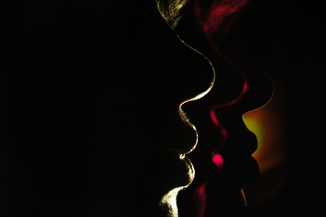
After creating the three edits of each of the colours and styles of the photos, I grouped them all together as 3 layers on a photoshop file. Then, I chose which colour I wanted as a base (red in the first one, yellow in the second), and copied and pasted the other two layers on top. Then, I changed the opacity of the two added layers to ensure you could see all three colours of light on top of each other. After that, I moved each image slightly to create a distorted effect where all of the photos were layered but her face was in a different position each time, meaning all 3 colours and layers could be clearly seen. When I was happy with how they looked, I altered each layer's brightness and contrast levels until I found the ideal amounts of each thing to make the photo work most effectively for what I wanted to do.
|

|
WWW: I love how the edits turned out, as the different layers piled on top of each other works really effectively and creates a sense of movement.
EBI: I would love to take photos using more colours on her face at one time, instead of just doing one at a time.
EBI: I would love to take photos using more colours on her face at one time, instead of just doing one at a time.
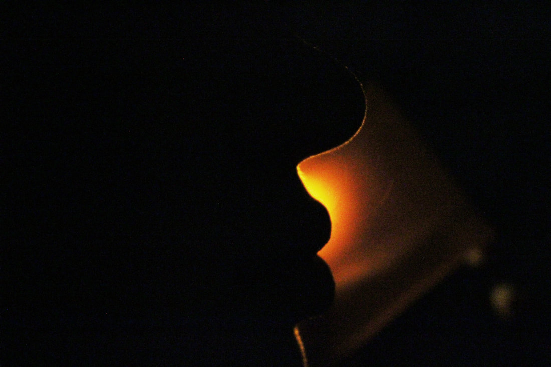
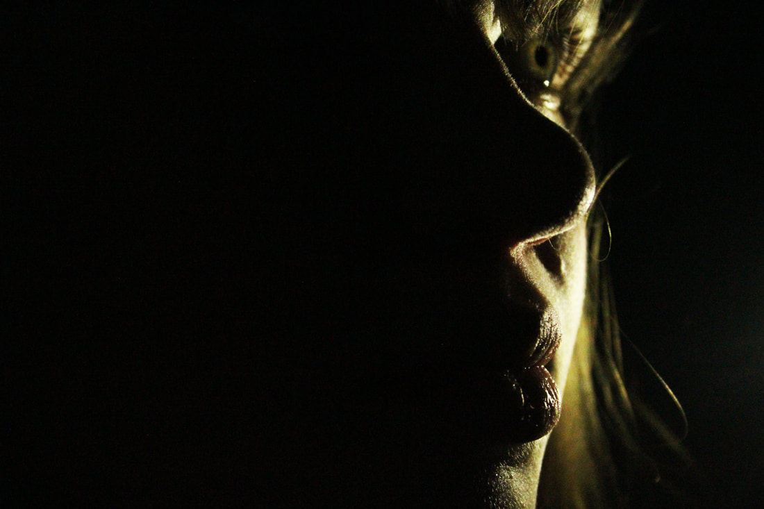
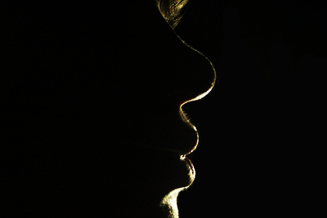
I decided to take more photos in this style at home, and I held up a torch with different colours in front of it to capture photos of my sister's face and side profile. I was really interested in trying to capture as little of her face as possible, and I did this by positioning the torch in a way that only showed a tiny bit of her face in the light. My favourite photos overall were the ones where the light just highlighted a small line which outlined her side profile, as I think these worked the most effectively and they were the type of photo that I was intending to take when I went into this shoot.
|
|
|
|
|
|
|
|
Again, I made edits of the similar photos all mashed together. I love the way these edits turned out as I tried to do something different to my last edits, where the colours were more random, and instead I created edits where each layer looks like a copy of the last, but with different colours. I think they all worked really well.
|
|
|
WWW: The edits and the photos turned out well and worked how I wanted them to.
EBI: If the light was more bright on every colour, and not just the plain white torch.
EBI: If the light was more bright on every colour, and not just the plain white torch.
